Defining idea
Applying edge
A strategic expression of the brand and business ambition, giving it clarity and confidence to lead the market.
Challenge
The European chemicals industry is under pressure from overcapacity, declining demand, economic volatility, and intense competition from emerging markets. Across the sector, a defensive narrative had formed, focused on managing decline rather than driving growth.
AEQUITA, long-term capital providers and specialists in turning challenge into change, saw opportunity.
Their investment led to the carve-out of selected assets from LyondellBasell, creating a new European polymers, olefins, paraffins and aromatics business with a bold ambition: to become Europe’s partner of choice for high-performing materials.
To achieve that ambition, the new business needed a brand that didn’t conform to category conventions. That signalled positive change to customers and partners. And united leaders and employees in the new company, creating a shared vision for what they could achieve.
This was a complex, high-stakes program that demanded strategic clarity, stakeholder alignment, and a structured approach to building the foundations for long-term growth.
Idea
Working closely with AEQUITA and the leadership team from the new business, we built the brand around a clear market proposition. One that reflected the strengths of the business – decades of expertise, manufacturing capability and deep customer relationships – while signalling something fundamentally different to the market.
“Applying edge” is the organizing idea that defined both the brand and the business’ ambition. It expresses their ability to combine technical depth with greater speed, agility and customer focus, helping clients move faster and unlock more value. It also reflects the advantages of a business designed around European markets and customers, able to respond faster, work closer, and deliver more tailored solutions.
The idea was the foundation for the entire brand, shaping the vision, positioning, messaging, identity and the new name, Velogy, inspired by velocity and energy.
The program we delivered became far more than a market-facing story. It created alignment among leaders, confidence among employees and a clear point of differentiation in the sector. Most importantly, it gave Velogy an idea they can own, reflecting who they are, how they show up in the market, and how they work with customers, partners, and each other.
In Brandpie we found a great partner with great ideas. They guided us through the process and, as a management team, we feel like this is our idea and ours to take forward.
Dario Giudici CCO, Velogy

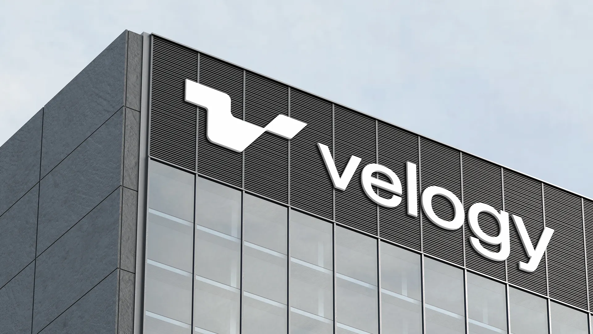
Breaking category conventions
A business determined to reshape its category should not conform to the expected.
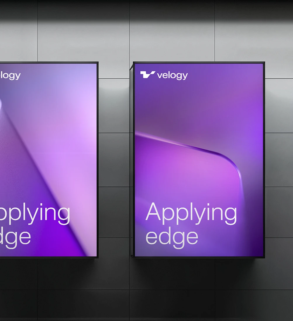
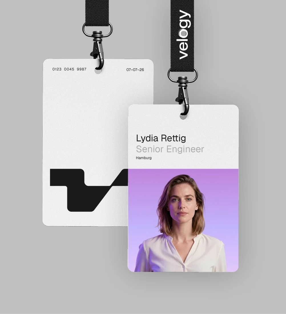
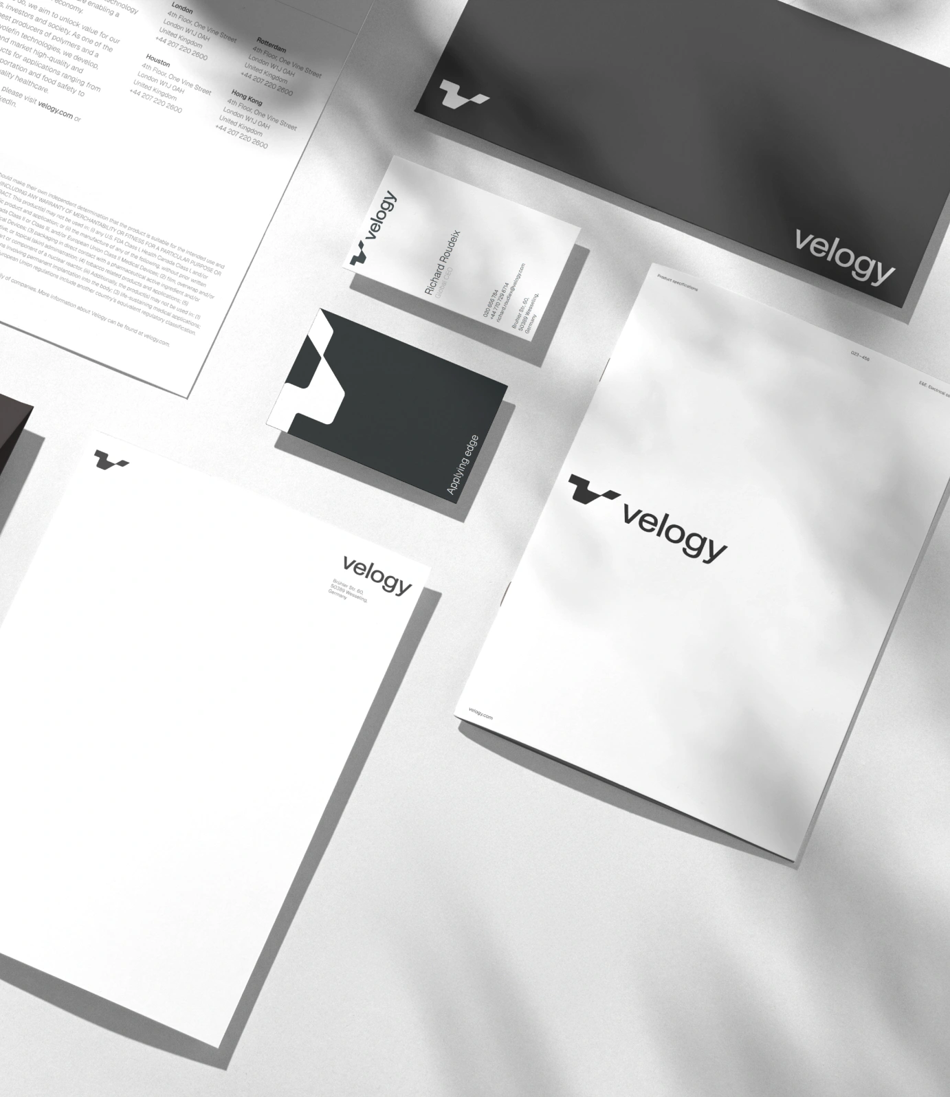
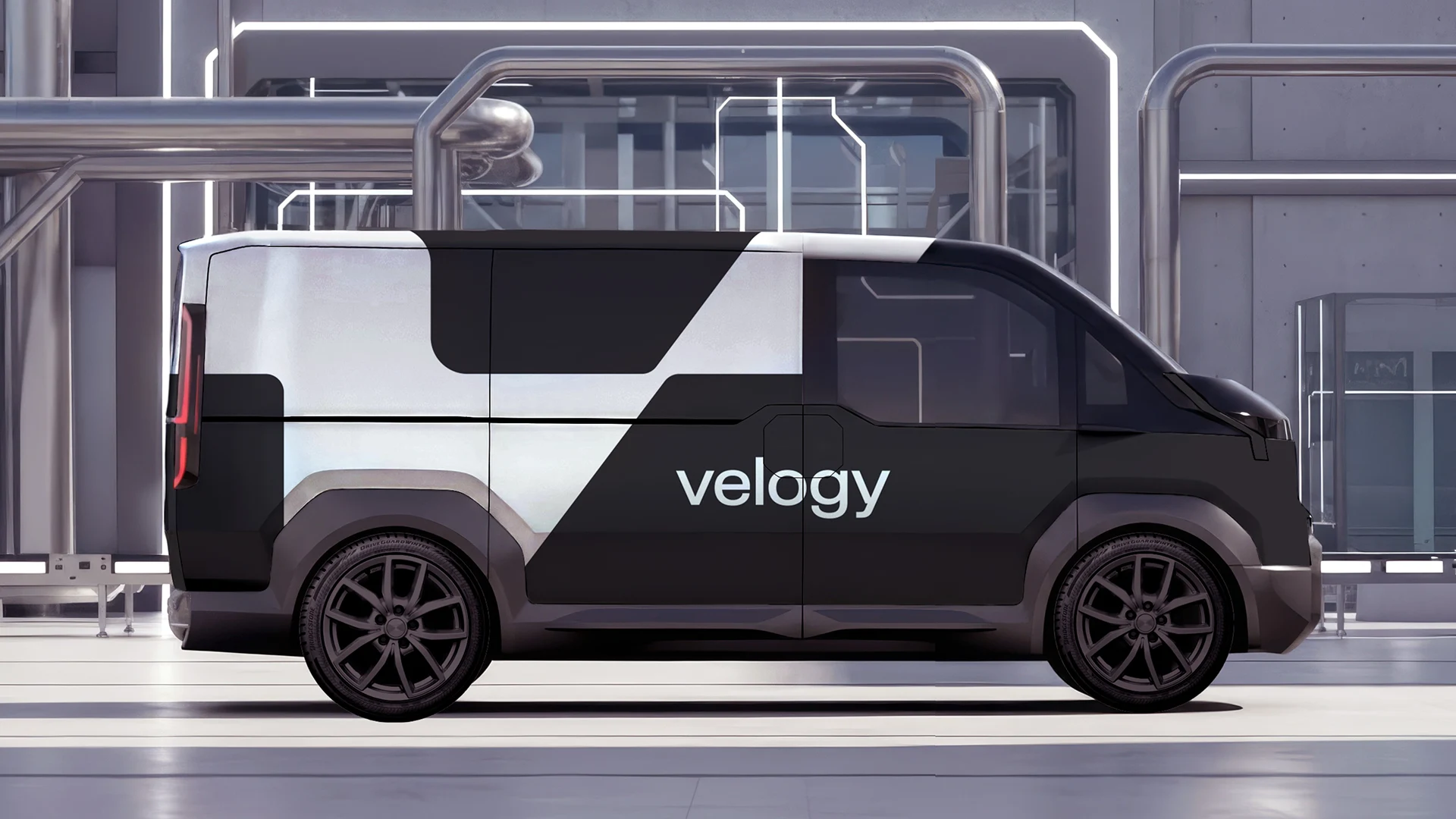
To break from industry convention, we moved away from the expected sea of blue, red, yellow and green, and introduced an ultraviolet purple palette that gives Velogy a distinctive and progressive visual presence. The identity signals ambition, momentum, and a forward-looking market position from day one.
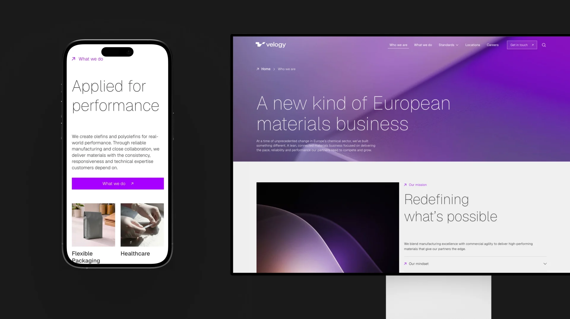
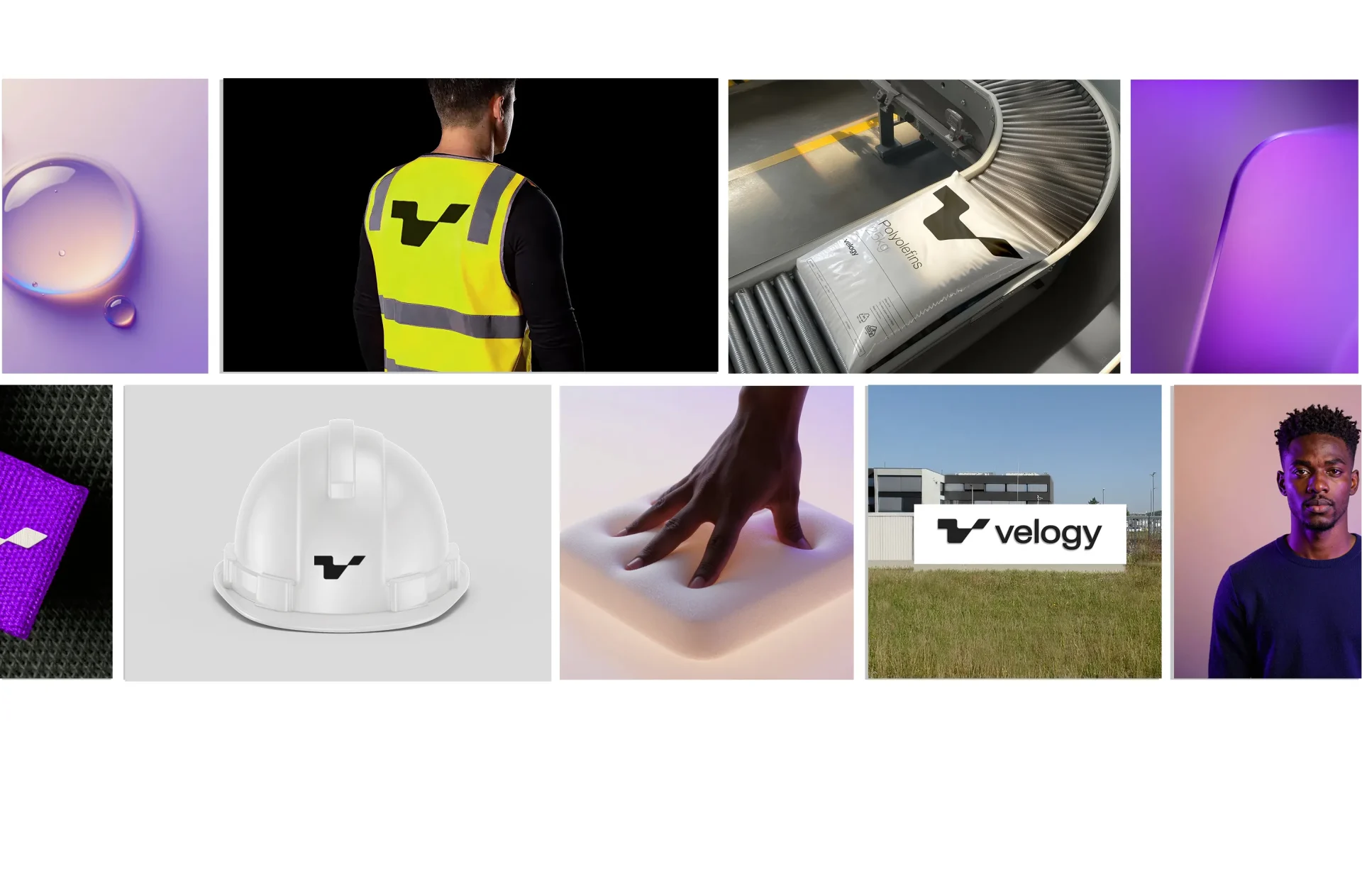
The idea of “Applying edge” runs throughout the identity system. From bespoke ultraviolet renders – unique to Velogy and endlessly adaptable – to the sharp yet flexible symbol inspired by the versatility of polymer materials, every element is crafted to feel precise, dynamic, and future-focused. A clean contemporary typeface and refined iconography further reinforce this sense of clarity and momentum.
Imagery plays a defining role in bringing the brand to life. Across product visualizations, editorial photography, and portraiture, light becomes a distinctive signature, creating moments of illumination and contrast that express the idea of the edge and build a cohesive, unmistakably Velogy visual world.
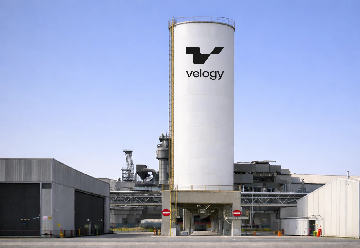
Launching with confidence
We designed, built, and launched the new Velogy website, creating a digital experience that communicates confidence, momentum, and category leadership from the outset.
Alongside the external launch, we worked closely with AEQUITA and Velogy leadership on internal engagement, aligning employees around the vision and helping teams understand the role they could play in shaping a different future for the European chemicals market.

Let’s talk
What would you like to discuss? We’re here to listen.