One brand. No trade‑offs.
SimonMed’s reputation was built on trust from the medical community. The question was how to extend that trust to a more consumer‑driven audience without fragmenting the brand.
By modernizing the Masterbrand and injecting a contemporary lifestyle feel, SimonMed can now speak fluently to both audiences – clinicians and consumers – without dilution.
The visual identity is built around four key principles:
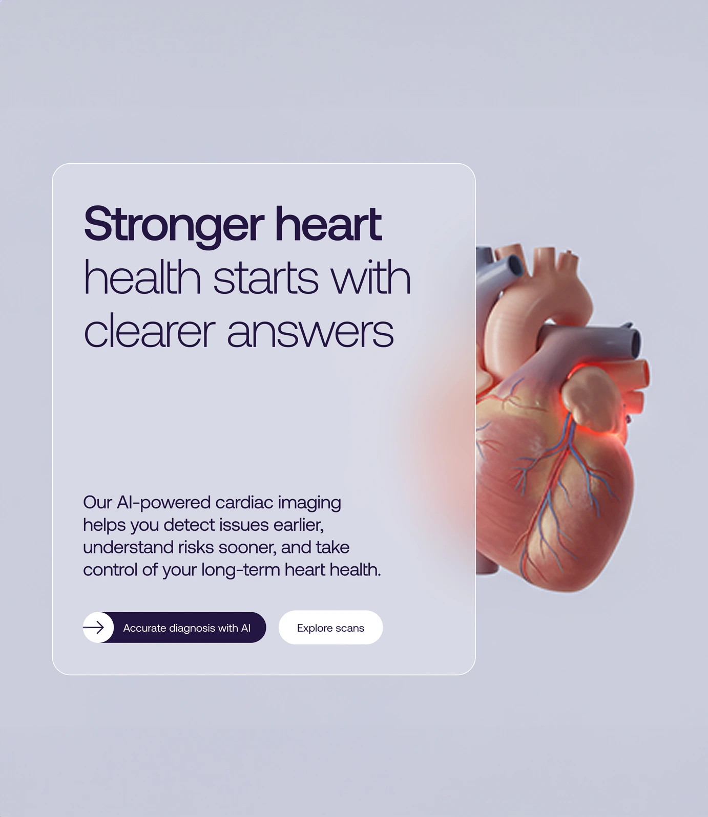
Simplifying the complex – The system acts as a bridge, translating dense diagnostic data into clear, intuitive insights that feel human and actionable.
Bridging clinical & lifestyle – It establishes a visual language that operates across two worlds, maintaining the precision needed for clinicians while adopting the warmth and vitality of a modern wellness brand.
Visualizing momentum and proactivity – Rather than feeling static or clinical, the brand uses motion to express forward momentum and clarity, reflecting the shift toward proactive health and longevity.
Humanizing technology – While powered by advanced tech, the visual experience remains empathetic and approachable, always prioritizing the person behind the data.
As part of the new visual identity we also created:
• An extensive original photography library for use across the new website.
• A full suite of motion assets.
• The launch film.
• Social media assets.
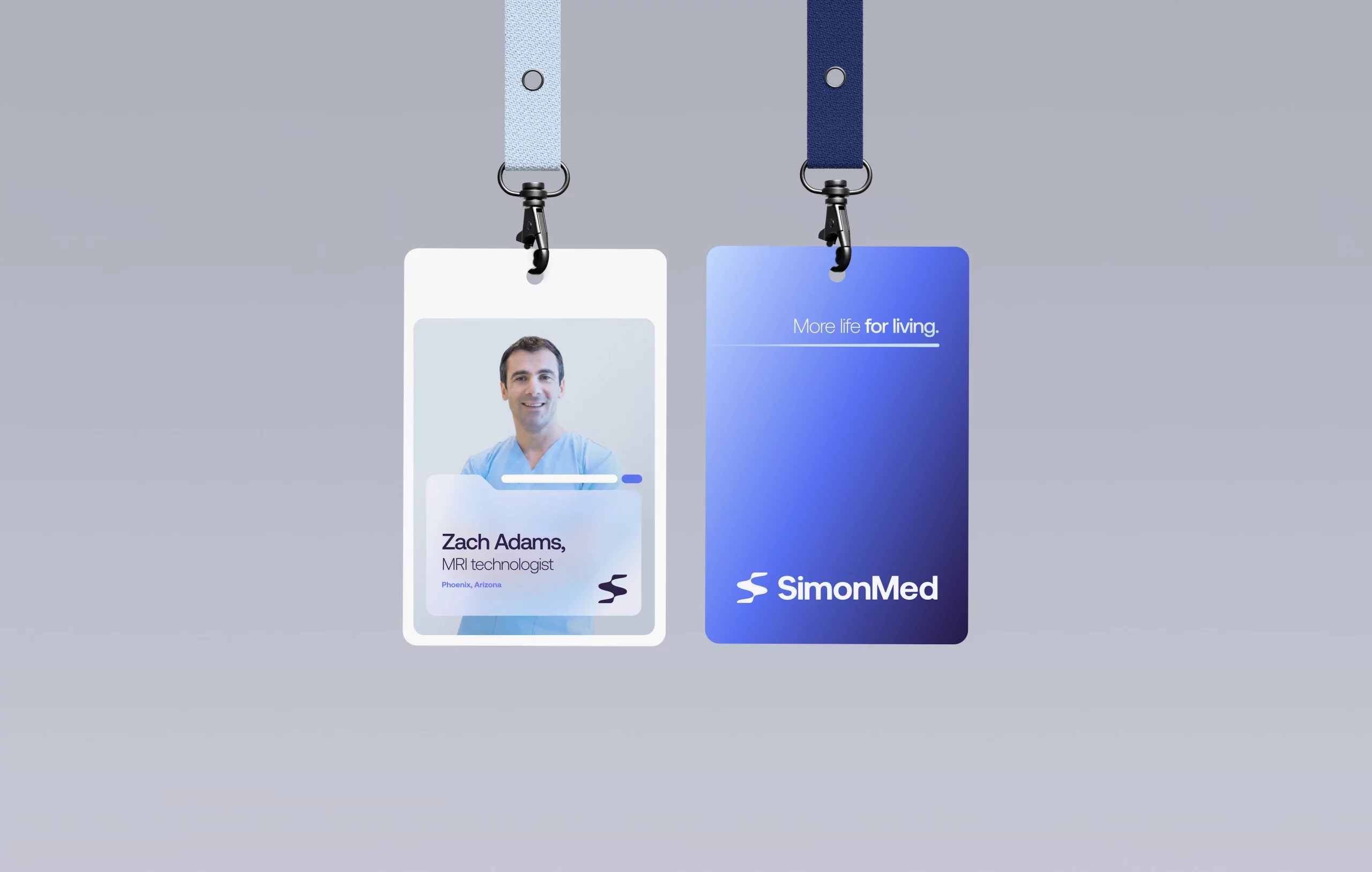
• New uniforms, signage, and materials for physical clinic environments.
• Templates for a wide range of printed collateral and go-to-market assets.
This is now a brand that speaks with authority and warmth, scale and agility, continuity and momentum.
One brand, ready to do more than ever.
Motion that connects people
At SimonMed, motion isn’t decoration. It’s how we express clarity, care, and credibility. Just like our diagnostics, motion helps people see more clearly, understand more easily, and feel more in control of their health.
We developed three core motion principles to guide how the brand behaves and moves:
• Reveal – Motion progressively uncovers information, directing focus and making complex medical content feel accessible rather than overwhelming.
• Clarify – Motion reinforces structure and logic, helping interactions feel intuitive, calm, and precise.
• Resonate – Motion that is subtle and responsive builds emotional reassurance and trust through timing, transitions, and micro-interactions.
Motion at SimonMed is used to build confidence, guide behavior, and bring humanity to technology.
Prioritizing humanity
Healthcare brands often default to a tone-of-voice that’s overly serious. Cold language. Clinical codes. SimonMed’s new identity does the opposite.
SimonMed’s new identity feels human and in motion – confident, clear, and emotionally resonant. Technology is still at the forefront, but it’s framed with empathy and clarity. This is expertise that feels approachable. These are experts who speak in everyday language.
The verbal identity centers on three truths:
• Access matters: preventive care should not be a privilege.
• Excellence is non‑negotiable: lives depend on it.
• Early insights change outcomes: for individuals, families, and communities.
Together, the visual and verbal identity now balance reassurance with optimism, and precision with possibility.
Activating from the inside out
We didn’t just design a new identity. We helped embed it across the business.
To drive internal alignment, we developed a national brand launch program rolled out across 170+ SimonMed sites.
Each location was supported by a local brand champion, ensuring consistent activation at every touchpoint, from leadership messaging to patient experience.
A brand built for growth
SimonMed now shows up with the stature it deserves, and a brand identity system with the craft and finesse expected of a leader. A brand with emotional appeal. A brand clinicians respect. A brand that every SimonMed employee can be proud of.

Let’s talk
What would you like to discuss? We’re here to listen.