SimonMed

Transforming clicks into care

SimonMed was built for the longevity era, combining cutting-edge diagnostics with a trusted clinical network. But its brand and digital experience hadn’t keept up.


We repositioned SimonMed as a healthtech and longevity leader: one that democratizes access to proactive care and empowers people to take control of their health. The website became a key tool to activate this positioning, translating clinical excellence into a lifestyle-friendly digital platform, designed to convert curiosity into action.

A brand ready for the future. A website stuck in the past.

SimonMed was shifting from diagnostics to prevention, from clinical to consumer, from reactive care to proactive longevity. Its website needed to reflect this shift.

The digital experience was outdated, fragmented, and hard to navigate. Patients couldn’t easily find services. Providers weren’t clear on the offer. And a huge commercial opportunity (preventative scanning) was going untapped.

The objective was clear: bring the new brand to life online. Reflect the new visual identity. Create a digital experience worthy of a modern, healthtech leader. And critically, unify a fragmented story into one simple, clear, and human-centered narrative.

Five smartphone screens side-by-side showing different SimonMed digital interface designs — including a support page with a doctor talking to a patient, a homepage with messaging about seamless AI-powered diagnostics, a screen highlighting specialty imaging like body scans, a scan-selection page featuring options such as mammogram, and a contact support screen with a smiling father and child. The layouts use clean typography, photos of people, and branded colors to represent various parts of the SimonMed mobile or web experience.
Platform

Bringing the pivot to life

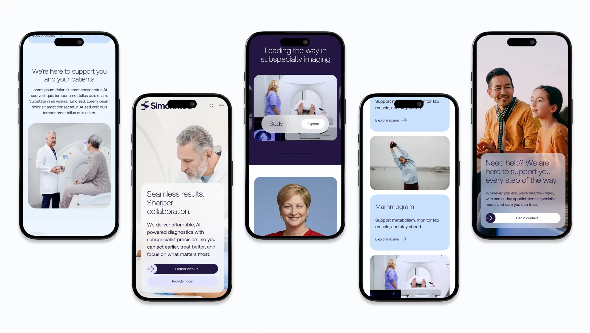
We designed and built a bespoke, curated, modular WordPress platform engineered to scale, perform, and support SimonMed’s growing ambitions. Now, the website is driving the business forward.
 
The website was a chance to bring SimonMed’s strategic pivot to life. Our brief?

• Tell one unified brand story across patients, providers, and payers.
• Support future growth in online bookings and direct-to-consumer sales.
• Feel like a brand born in the healthtech era, not the healthcare past.

A webpage interface section showing SimonMed digital content about why more patients choose the service. At top left is a photo of two smiling women walking outdoors, with informational expandable text panels on the right titled “Precision screening for peace of mind,” “AI‑powered insights for clear next steps,” and “Expert imaging specialists you can rely on.” Below is a headline reading “Why more patients are choosing SimonMed,” followed by three icon‑and‑text features highlighting advanced technology, specialized radiologists, and 170+ locations. At the bottom left is a professional headshot of a woman, likely a Director of Women’s Imaging, with a quote about early detection and AI‑enhanced breast im
A section of the SimonMed website showing MRI scan options and planning steps. At the top is a headline “Scans for everyone read by our leading specialist radiologists” above three pricing cards for different whole‑body MRI packages with introductory prices and included scan areas. Below are three labeled steps for planning a visit — “Book,” “Scan,” and “Results” — each with short instructions. At the bottom left is text about trusted MRI centers with a dropdown to choose a state, and on the right are location search fields with buttons to view specific center details.
Audiences

One brand. 
Two audiences. Endless potential.

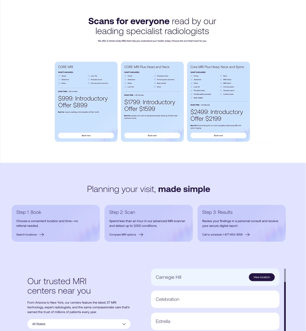
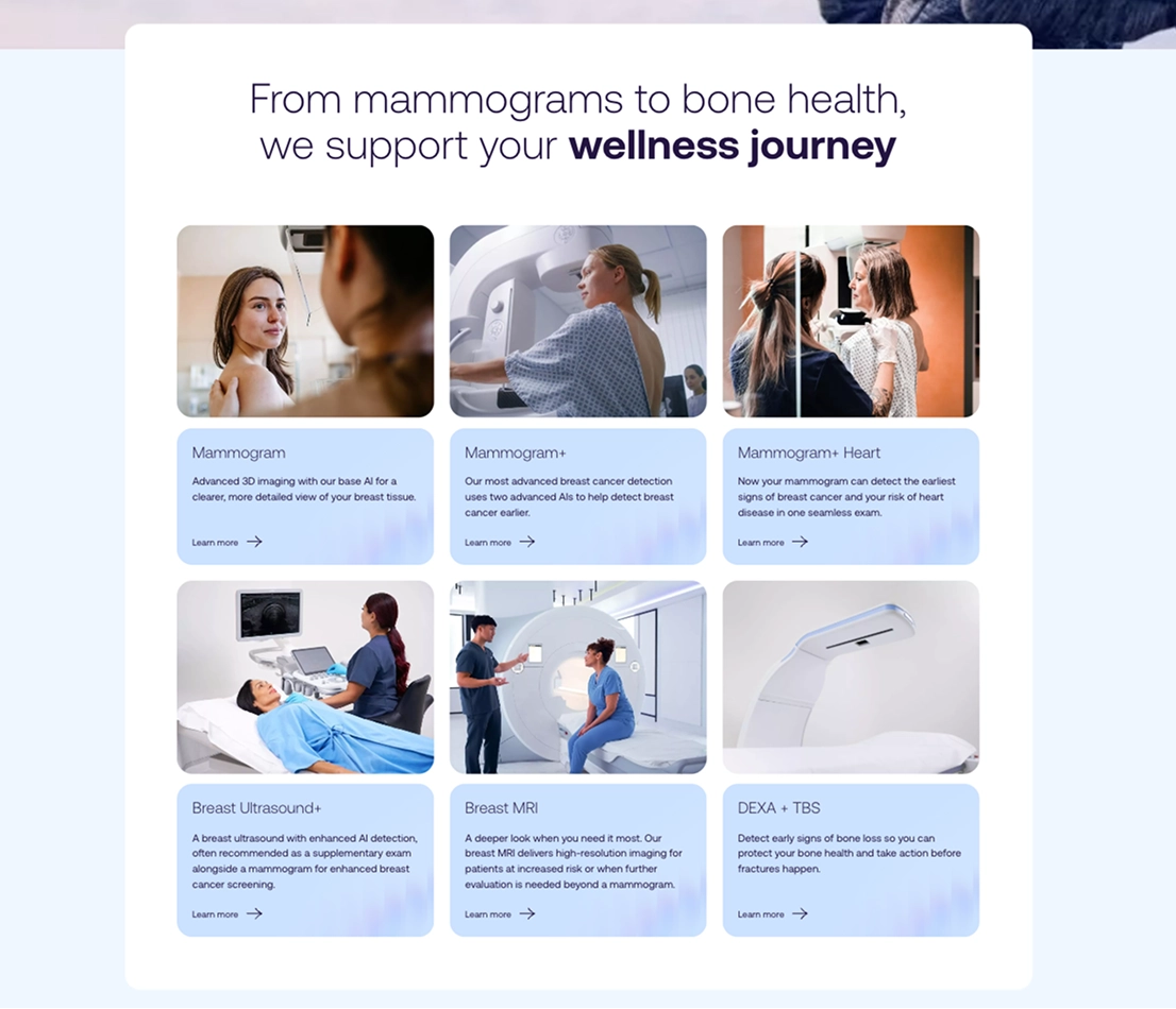
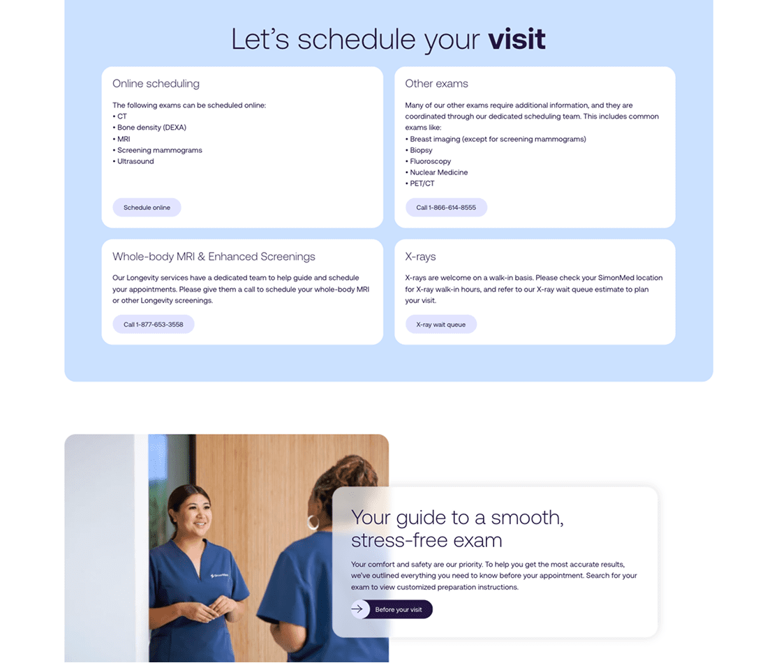
The website is built to support both clinical referrals and consumer-led health journeys through:

• Streamlining the user experience (UX) for faster path to booking.
• Built-in flexibility to scale across services, geographies, and content.
• Storytelling that builds confidence and converts curiosity.
 
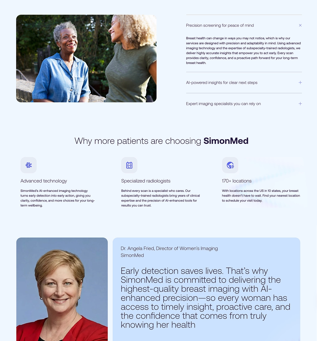
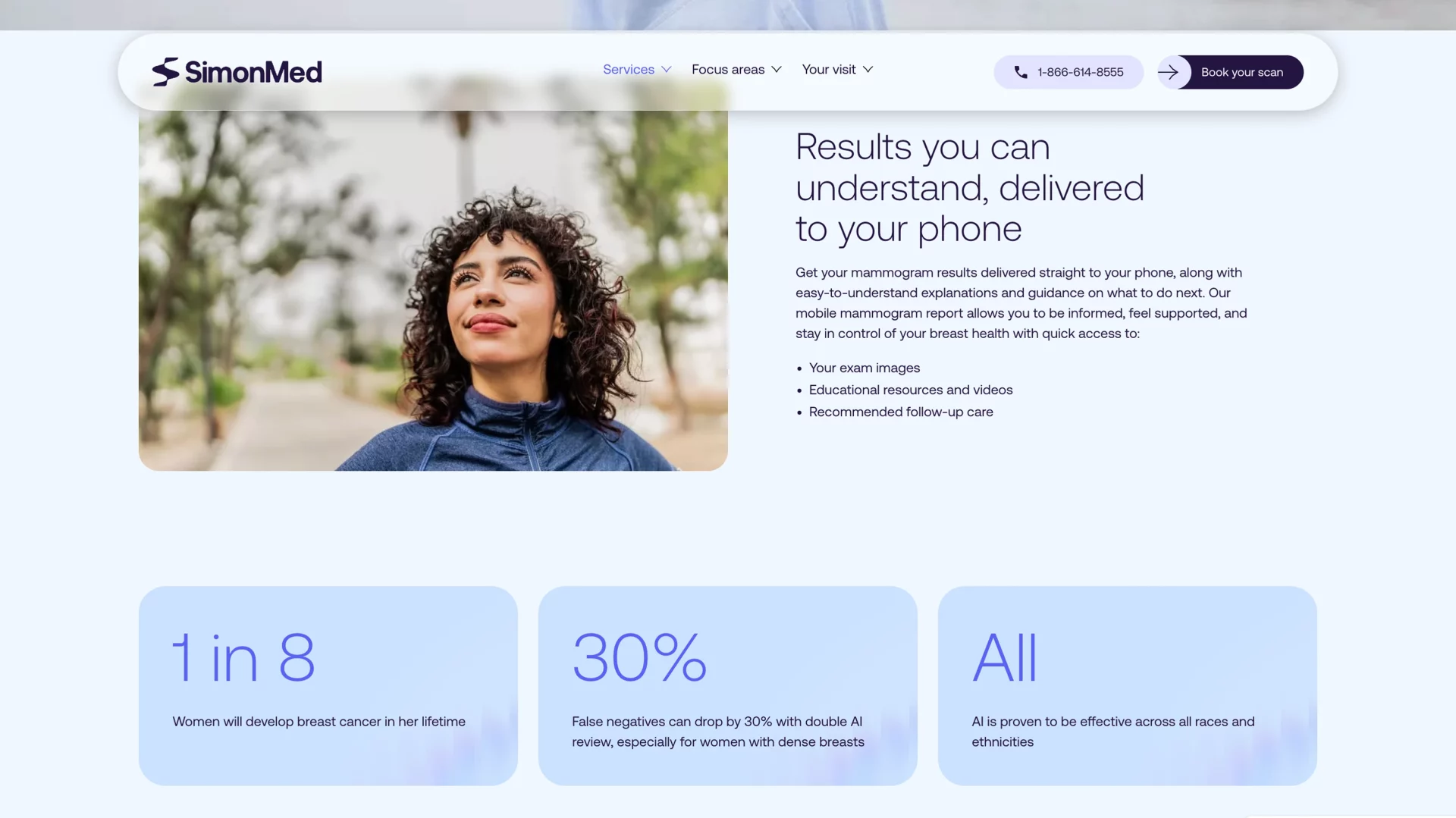
Every choice was made to bridge clinical authority with consumer trust. The result is a platform that doesn’t just look better but works smarter.

A webpage section titled “From mammograms to bone health, we support your wellness journey,” showing six service cards. The top row includes photos and descriptions for “Mammogram,” “Mammogram+,” and “Mammogram+ Heart.” The bottom row shows images and labels for “Breast Ultrasound+,” “Breast MRI,” and “DEXA + TBS,” each with brief explanatory text and a “Learn more” link. The layout uses light blue cards and clinical‑style imagery of patients and imaging equipment.
A section of the SimonMed website titled “Let’s schedule your visit” on a light blue background showing four rounded information panels. The top left panel lists exams that can be scheduled online — CT, bone density (DEXA), MRI, screening mammograms, and ultrasound — with a “Schedule online” button. The top right panel lists other exams that require scheduling help, such as breast imaging (except screening mammograms), biopsy, fluoroscopy, nuclear medicine, and PET/CT, with a phone number button. The bottom left panel describes whole‑body MRI and enhanced screenings with a contact phone number, and the bottom right panel notes that X‑rays are welcome on a walk‑in basis with a “X‑ray wait queue” button. Below this section is a photo of two smiling medical staff in blue uniforms and a callout box saying “Your guide to a smooth, stress‑free exam” with a button to view preparation instructions.
Proactive healthcare

Built for what’s next

As SimonMed expands its D2C services and redefines proactive healthcare, the new website will be a key growth engine, connecting purpose, product, and patient in one seamless digital experience.

Built to speak to physicians, patients, and proactive consumers alike, the new website makes the brand’s pivot to prevention feel real, human and accessible, ready to support a new kind of healthcare relationship.

A SimonMed webpage section showing “Results you can understand, delivered to your phone.” At the top left is a photo of a smiling woman in a park setting, and to the right is a headline about getting mammogram results on your phone with explanations and guidance. Below are three light blue information panels with statistics and facts about breast cancer risk and AI effectiveness in imaging. The SimonMed logo and navigation bar appear at the top.
Our process

Our approach

A proven, scalable process for high-performance digital experiences:

• Discovery & stakeholder workshops
• UX mapping & information architecture
• Wireframes & UI design
• Custom WordPress build
• Technical SEO & performance optimization
• QA, staging, analytics
• Ongoing evolution

Person smiling and listening during a conversation, wearing a sleeveless dark top.

Let’s talk

What would you like to discuss? We’re here to listen.