Challenge
The Royal Albert Hall is a national cultural treasure. But despite its iconic status, the Hall’s brand had become diluted over time. The brand was showing up inconsistently and that was, in turn, resulting in low levels of recognition among its audiences.
Post-COVID, newly appointed CEO James Ainscough called for a strategic pivot to reposition the Hall to connect with broader, more diverse audiences. Brandpie was brought in to help define and articulate a new vision, galvanize leadership, and inspire internal teams.
Because the Hall doesn’t simply host a performance – it elevates it. And the brand had to reflect that.
Idea
A new vision, “To be the home of breathtaking moments and lasting memories, for everyone. Together, we create the amazing”, was developed to capture the idea that artists, audiences and staff work together to create the experiences that make the Hall amazing. This was used as a springboard to evolve the identity.
Our creative approach was grounded in a simple strategic principle: don’t get in the way of what makes the Hall amazing. The brand needed to honor and to amplify the Hall’s role as a cultural catalyst, without competing for attention.
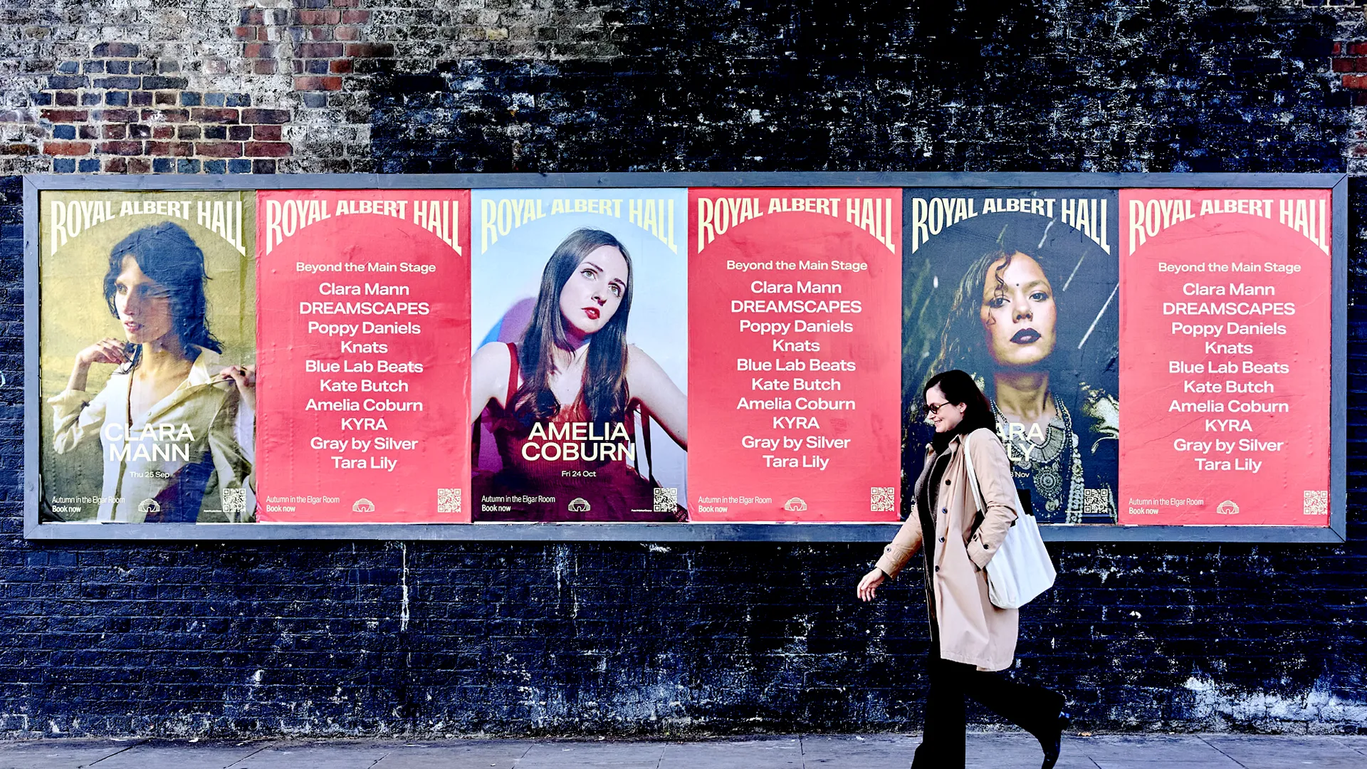
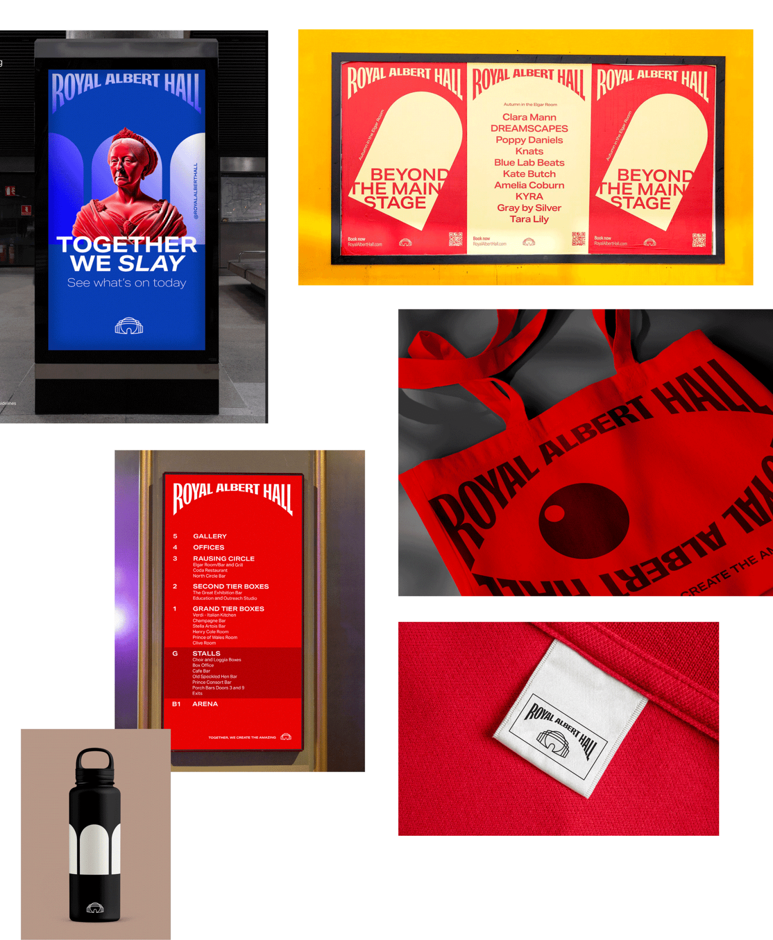
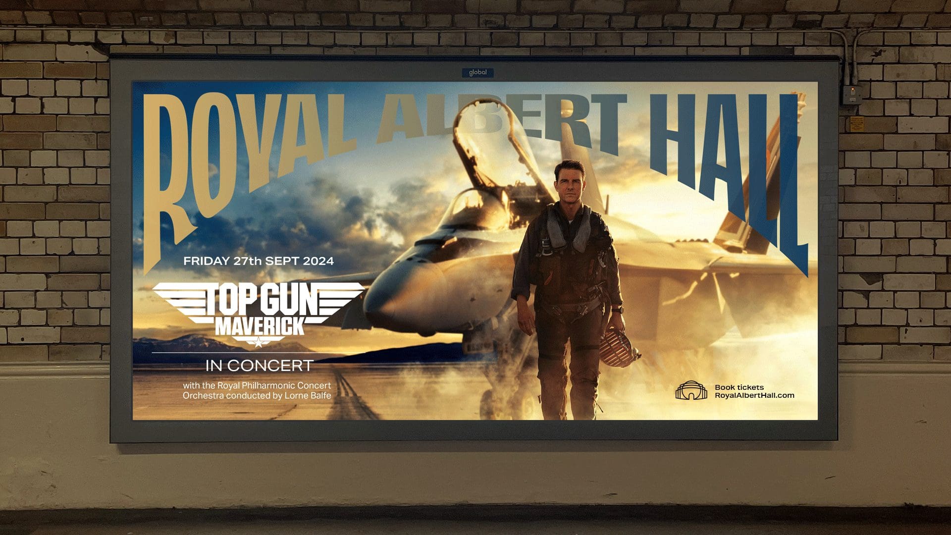
Brandpie and the Royal Albert Hall team worked to deliver a refreshed identity that is more modern – engaging new and younger audiences – builds greater consistency across applications, and, importantly, strengthens the visibility, presence and recognition of the Royal Albert Hall. This was brought powerfully to life by the Royal Albert Hall’s in-house team in their campaign promoting the Grand Sumo Tournament. The new brand assets shone across print, digital and out-of-home creating a distinctive campaign and powerful brand statement.
Tonight Sumo begins at the Hall. And the new Masthead is being deployed throughout the building. It looks amazing! I really do believe it’s an award-winning level, and our teams right across the Hall are using it with great pleasure. It has gone global thanks to the TV coverage – looking vibrant and striking on BBC iPlayer here in the UK and other broadcast platforms right around the world. We’re even seeing on social media that people are stopping by our Sumo posters around London to have their photos taken – surely proof of how exceptional the new design is! Thank you once again.
James Ainscough CEO, Royal Albert Hall
A more resonant Royal Albert Hall
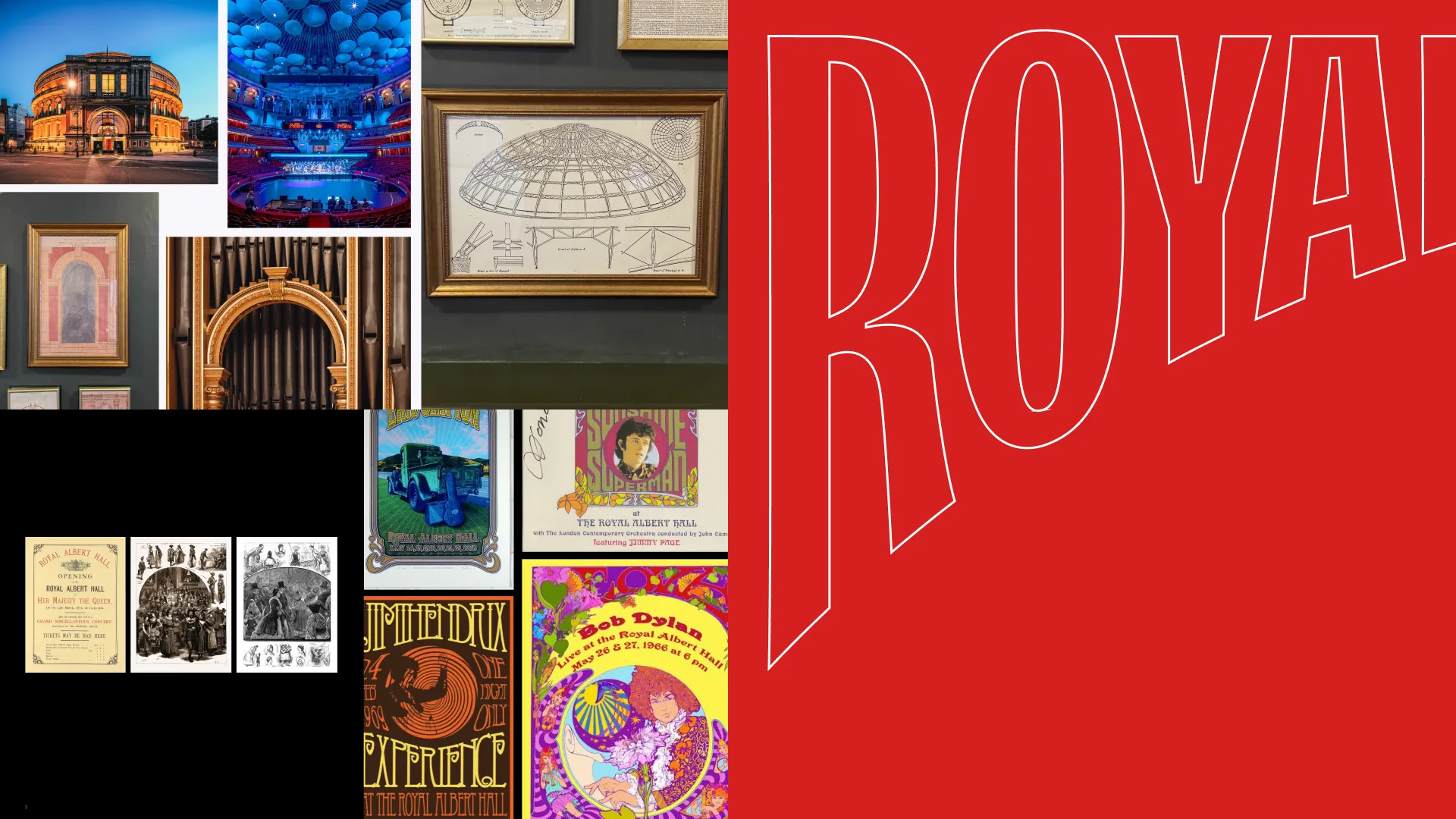
The new masthead design is built directly from the architecture and cultural legacy of the Hall itself. Letterforms reference hand-drawn Victorian typography, balanced with subtle nods to the bold poster graphics of the 1960s and 70s. The result is a wordmark that feels timeless and commanding, equally at home on a program for a ballet as on a poster for a rock concert.
Taking cues from editorial design, the masthead now serves as a fixed anchor point in communications, offering consistency while allowing creative expression across different types of content. This unlocks freedom without losing stature, enabling a tonal range from reverent to youthful, from regal to radical.
Key creative decisions reinforced the brand’s reassertion:
Deliberate choices in the design sharpen and simplify:
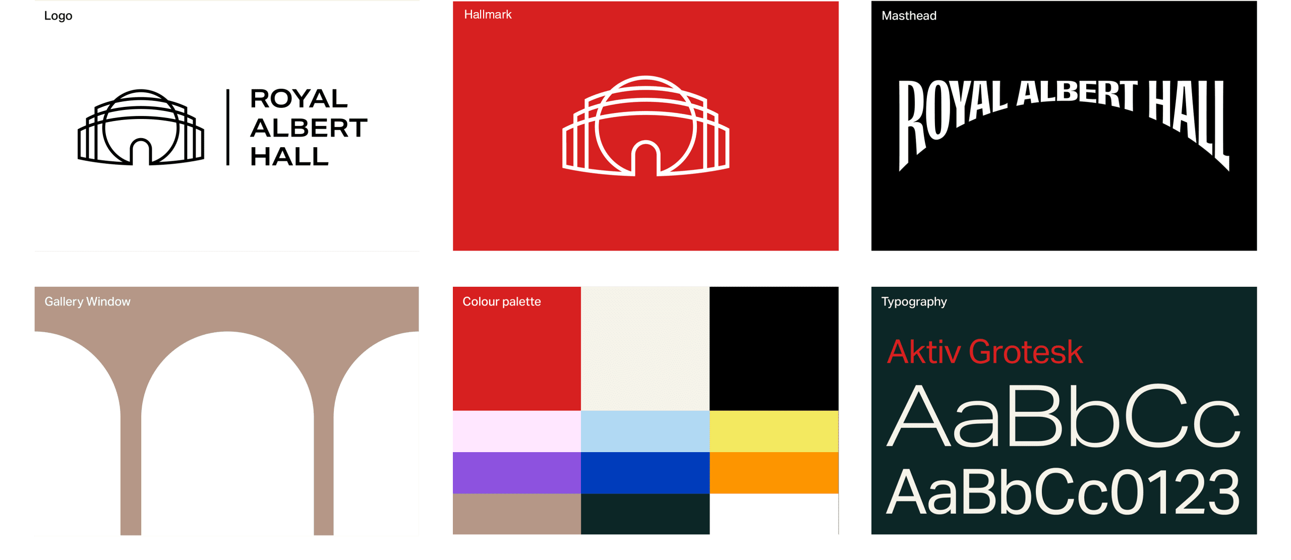
Typography
We introduced Aktiv Grotesk to give the Hall a more dynamic voice. It brings range, personality, and modern energy while remaining legible and elegant.
Color
We redefined the Hall’s signature red, which had previously diluted across a spectrum of shades, into a bold, distinctive tone that now acts as a recognizable thread across signage, digital, and print.
Recognition
By putting “Royal Albert Hall” front and center, and elevating it above the symbol, we re-established the name as the core asset, restoring clarity, authority, and cultural weight.
Built to last
Importantly, this refresh is designed to be gradual. Aligned to the Hall’s broader modernization timeline, implementation will unfold in phases, ensuring coherence with funding realities and operational change.
This was not about creating a new brand but about elevating it above the noise, amplifying what matters, and giving the Hall the confidence to stand tall.

Let’s talk
What would you like to discuss? We’re here to listen.