Challenge
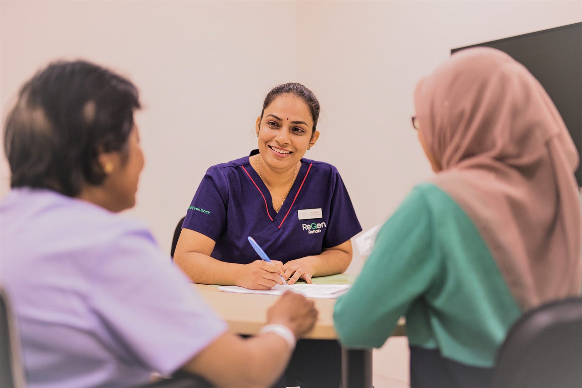
In Malaysia, the outlook for individuals with serious spinal injuries was bleak. While rehabilitation rates in the US and Europe reached as high as 70%, in much of Asia, including Malaysia, that number barely reached 30%. The problem was awareness, infrastructure, and a lack of inspiring examples that challenged what recovery could look like.
The goal was ambitious: create a rehabilitation service that made high-quality recovery both possible and affordable for Malaysian communities. But to achieve that, ReGen needed a brand that could redefine what people believed was possible after spinal trauma.
Idea
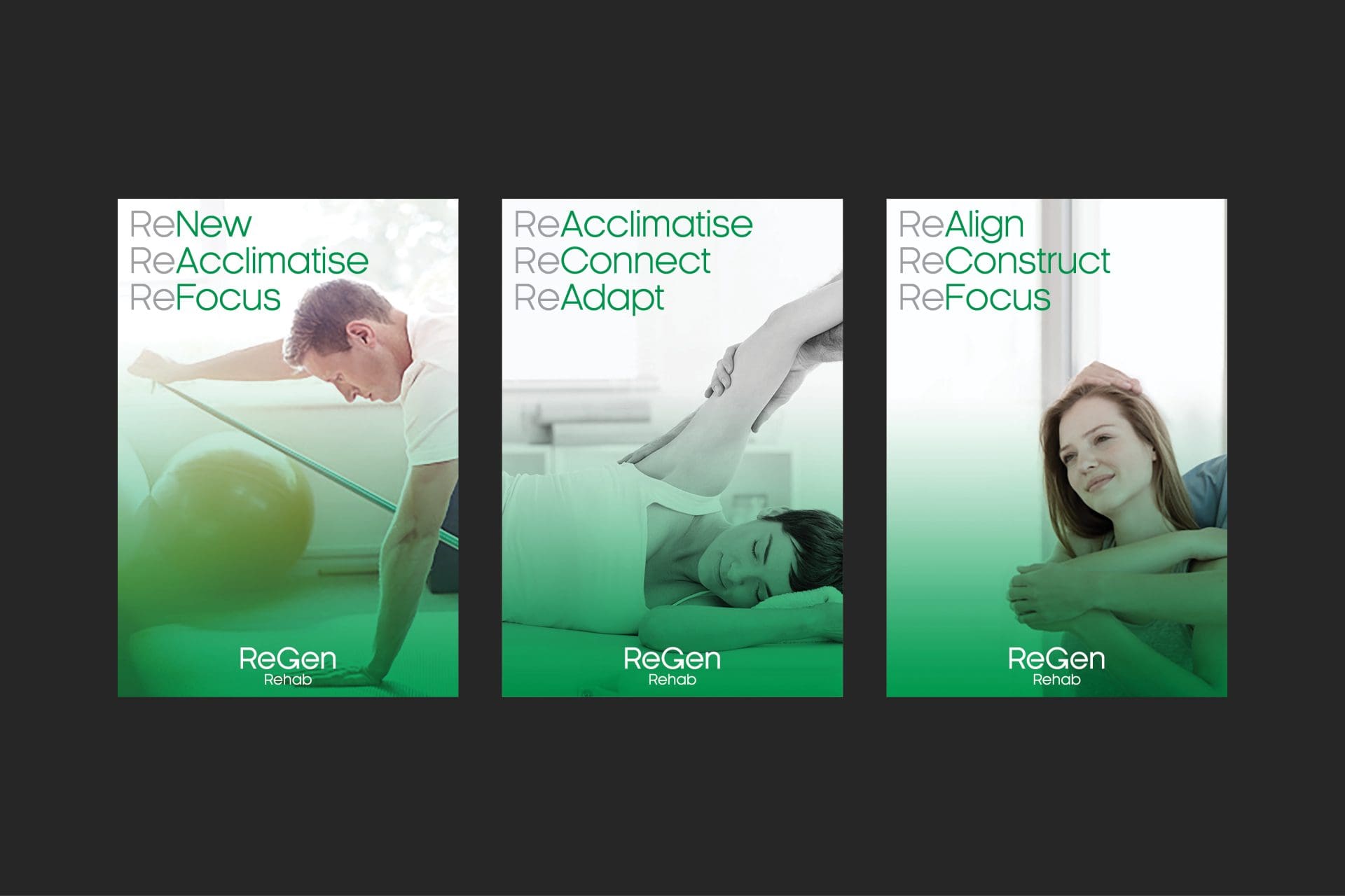
We created a brand identity rooted in the radical idea of reversal, not just recovery.
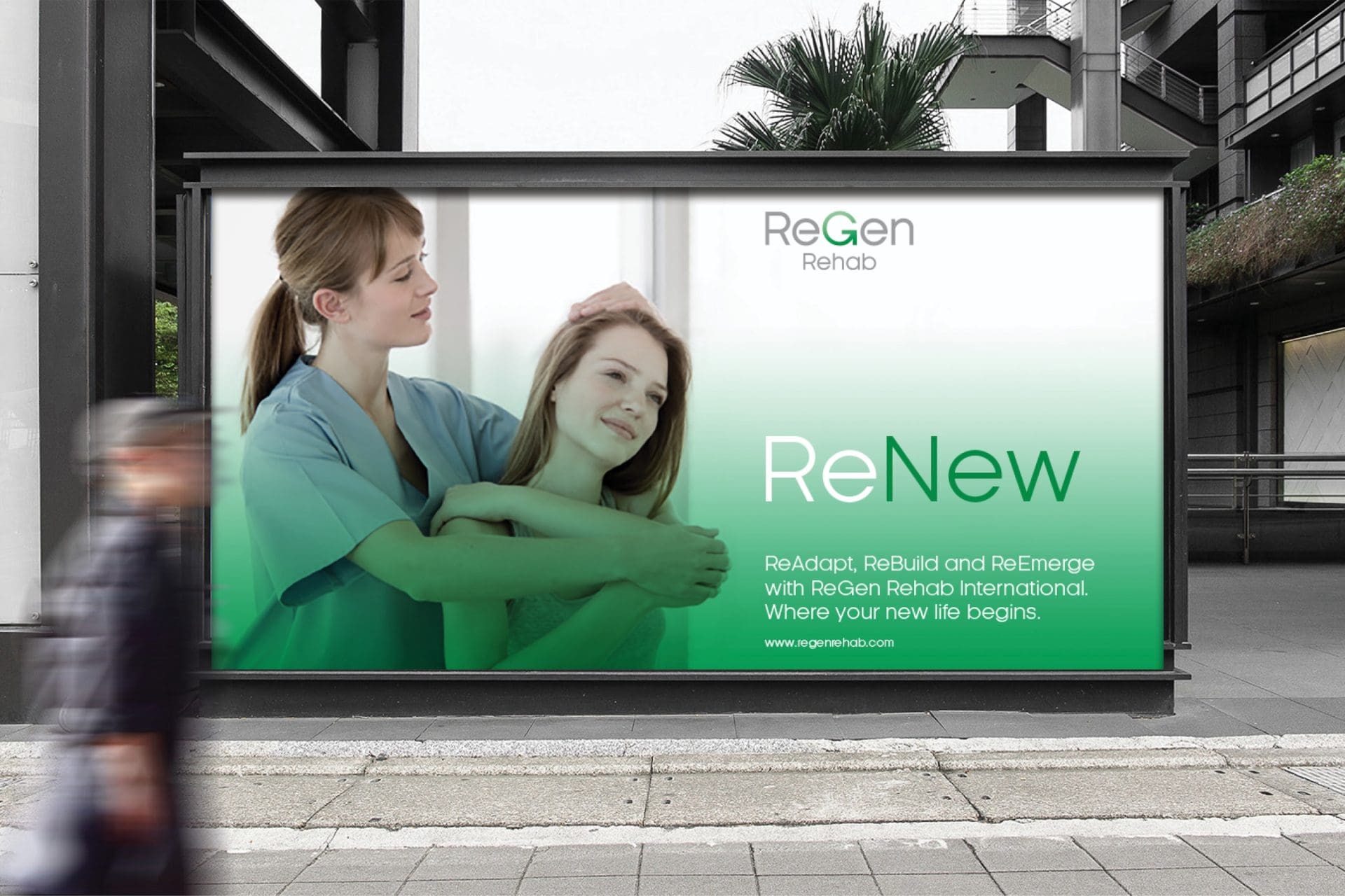
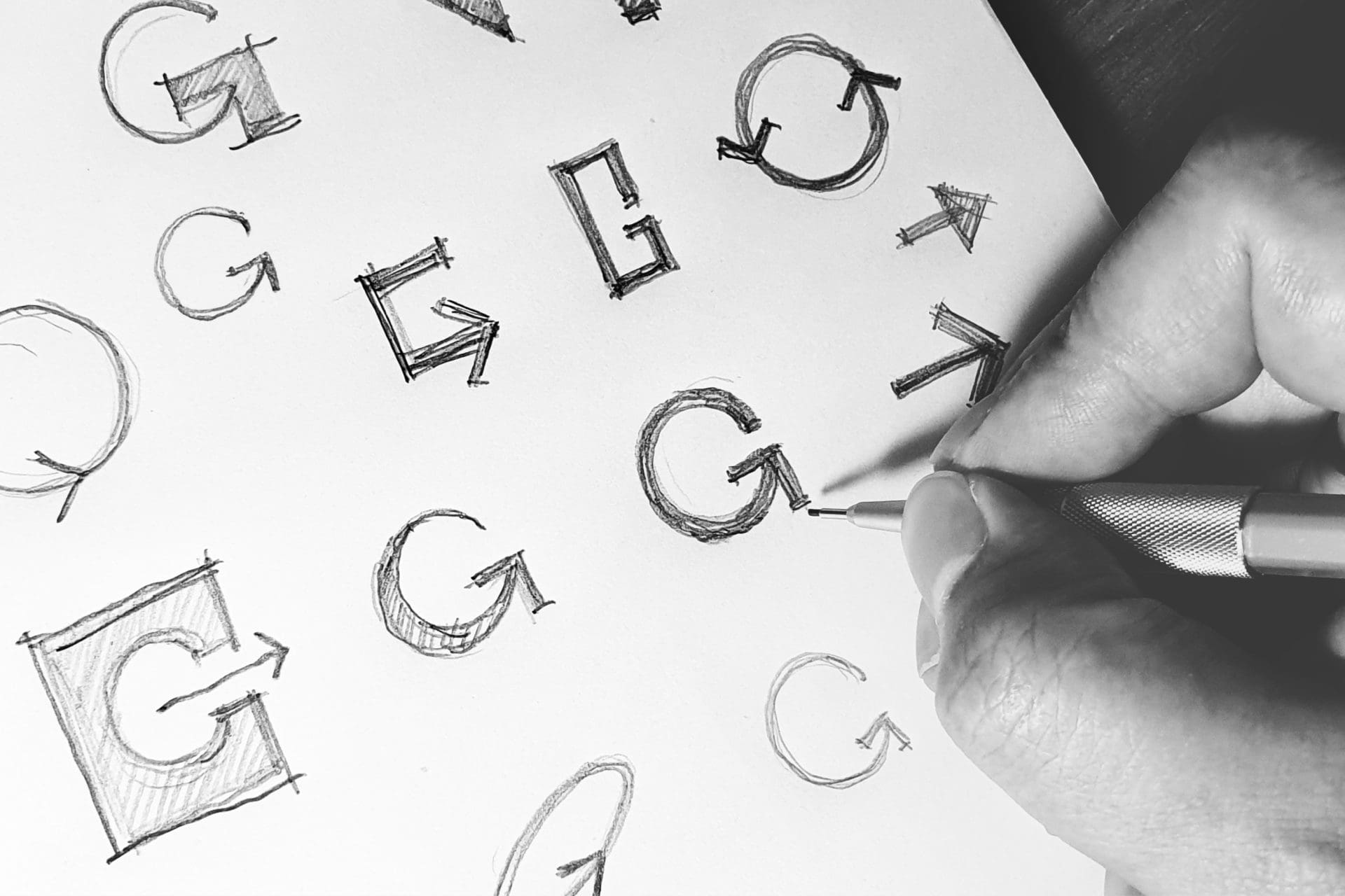
A simple, elegant ‘G’ forms as a backward-pointing arrow became the centerpiece of the brand: a symbol of turning back time, restoring movement, restoring dignity, restoring life.
The design tells a story of hope – not just in words, but in its very shape. The visual metaphor of “reversing your situation” carries emotional weight for patients, families, and clinicians alike. It became a rallying cry for a new kind of rehabilitation experience, where people saw a real pathway to getting their life back.
Reversing the odds through brand
The ReGen identity was built to attract patients, but also to reframe an entire category. It challenges long-held assumptions about what’s possible in spinal injury care across Southeast Asia.
An identity rooted in narrative
More than just a logo, the identity unlocked a powerful narrative:
- Culturally resonant: By blending Western rehabilitation principles with Southeast Asian accessibility, the brand bridges a crucial gap in understanding.
- Locally empowering: Positioned as a local solution to a global disparity, it offers Malaysians a chance to recover without losing hope or leaving the country.
- Visually iconic: The backward arrow in the “G” represents more than clever design. It represents a promise. That what feels like the end could, with the right help, be a beginning again.

Let’s talk
What would you like to discuss? We’re here to listen.
Related work