HS Orka

Shifting perception to power a nation

Moment

Strategic pivot

Sector

Energy

Services

Brand

Challenge

HS Orka plays a vital role in powering Icelandic communities, delivering renewable energy that enables everyday life, supporting local businesses and contributing to the country’s sustainable future. With the ambition, capability and capital to expand their operations, the business was well positioned to meet Iceland’s growing energy demands.

But their impact and approach weren’t fully understood.

In-depth market research, led by one of our partners Brandr Index, revealed a lack of clarity around HS Orka’s role, values and long-term contribution to Iceland. Without a clear, unified brand story, those questions remained unanswered.

This presented an opportunity to align leadership around a new direction for the brand that would allow HS Orka to take control of its narrative, strengthen community relationships, and support future business growth.

Idea

Create a brand that reflects HS Orka’s distinct approach and reconnects people with its purpose.

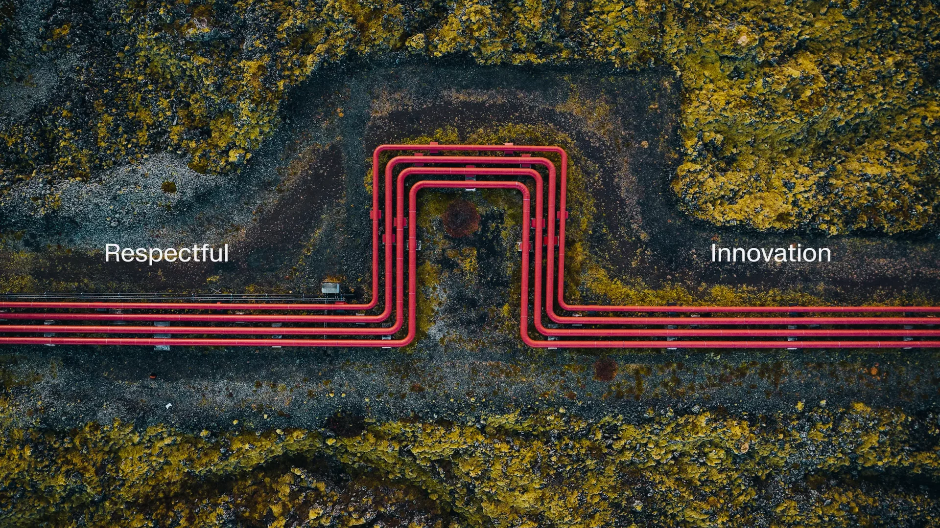
At its core is a bold creative idea: Respectful Innovation – capturing how the company balances progress with care and puts community at the heart of everything it does.
 
Rooted in HS Orka’s approach to circularity – seen most clearly in the Resource Park, where geothermal byproducts are repurposed to support new industries – Respectful Innovation reflects the company’s commitment to developing energy infrastructure that creates long-term value for Icelandic communities.

Leadership alignment around the new direction was crucial. A collaborative process of workshops and immersion, both in London and on-the-ground in Iceland, brought the leadership team together to align around the idea and take ownership of the brand’s narrative and future.
 
That time in Iceland was essential. It revealed how different HS Orka truly is from other energy companies – considered in every decision, transparent in action, and deeply embedded in the communities it serves. That ethos inspired and shaped the idea of Respectful Innovation.
 
In a sector dominated by rational messaging, Respectful Innovation gives HS Orka a more human voice, and a platform to build trust, shift perception, and tell a story that truly reflects who they are.

This was more than a rebrand. It was about redefining how we tell our story. Brandpie helped us articulate what makes HS Orka different in a way that’s true to who we are: respectful, innovative, and deeply rooted in Icelandic society.

Jóhann Snorri Sigurbergsson Director of Business Development, HS Orka

A horizontal graphic composition showing several visual identity elements for HS Orka’s refreshed brand. On the left is a bold red square with a simplified circular icon made of curved lines suggesting energy waves and flow. Next to it is the “HS ORKA” wordmark in a clean modern typeface. Surrounding these are examples of brand applications: a staff member interacting with geothermal infrastructure, close-ups of industrial equipment and piping integrated with natural landscapes, and text blocks highlighting the concept of “Respectful Innovation” that balances technological progress with care for community and environment. The overall palette uses strong reds paired with neutral tones to reflect the company’s renewable energy focus and purposeful, people-centred brand approach.

Owning the narrative

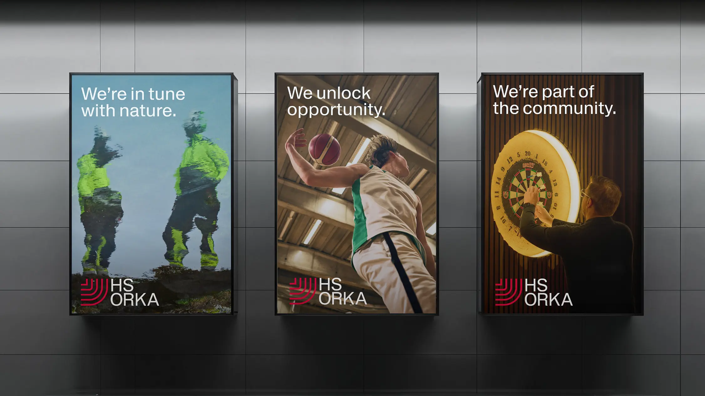
HS Orka needed to own its story, reflecting its Icelandic values while giving the brand a voice of its own. We built that narrative around three core pillars:

  • Nature – A deep respect for the land that makes energy possible. 
  • Opportunity – Innovation that stays in Iceland and benefits its people. 
  • Community – Powered by local hands and guided by national purpose. 

This helped reframe the business not as an outsider, but as an active partner in Iceland’s future.

HS Orka consistently demonstrates what progress with care looks like: minimizing impact, creating long-term opportunity, and working in harmony with the communities it serves. Now, its brand reflects that.

Three large vertical brand posters displayed side by side on a wall promoting HS Orka’s “Respectful Innovation” identity. The left poster shows two workers in reflective gear standing in nature with the text “We’re in tune with nature.” The center poster features a person playing basketball reaching up with a ball, with the text “We unlock opportunity.” The right poster shows someone aiming at a dartboard in a social setting with the words “We’re part of the community.” Each poster includes the red and white HS Orka logo at the bottom
A close-up of the side of a modern industrial building with curved rooflines and large vertical glass or metal panels. On the greenish-blue façade is a bold red graphic logo made of several curved lines forming a stylised abstract emblem. The sky above is clear with soft light illuminating the structure. (Image from HS Orka brand project by Brandpie showing branded signage on a building exterior.)

A brand rooted in heritage, ready for the future

The visual identity refresh was was about refinement, not reinvention. The identity needed to rebuild trust, not mask who HS Orka is. It had to feel refined, human, and rooted in place, just like the company itself.
 
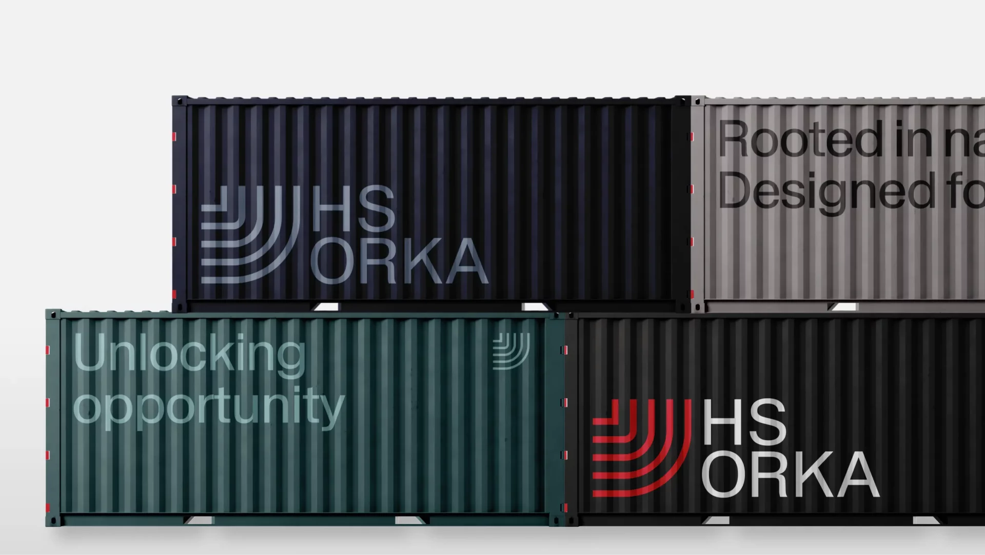
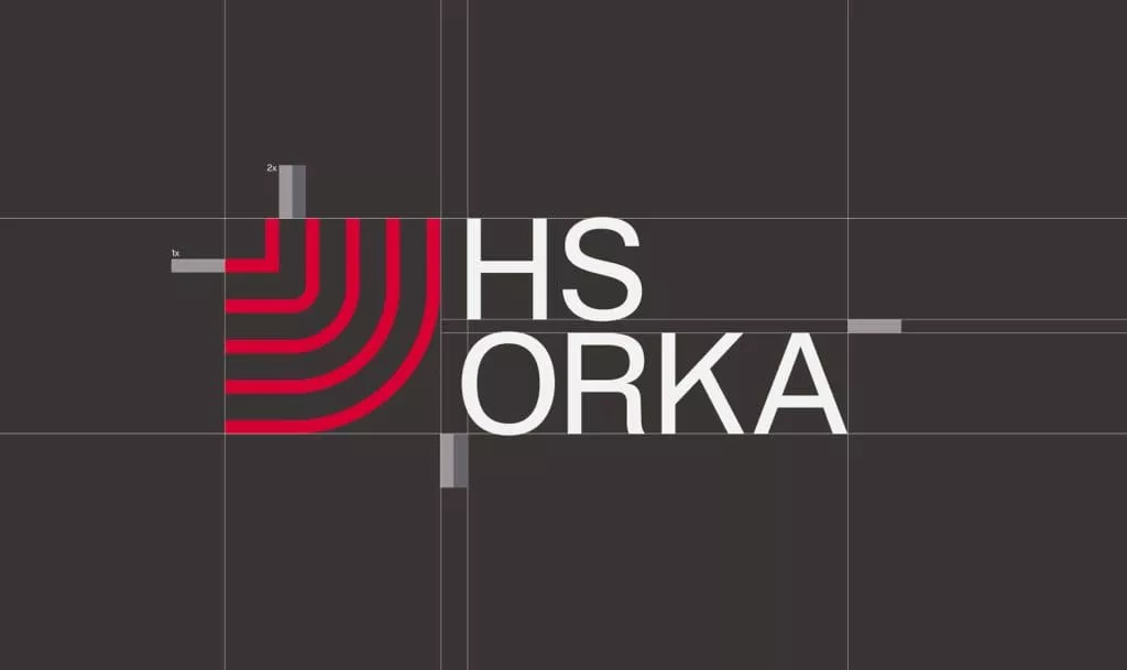
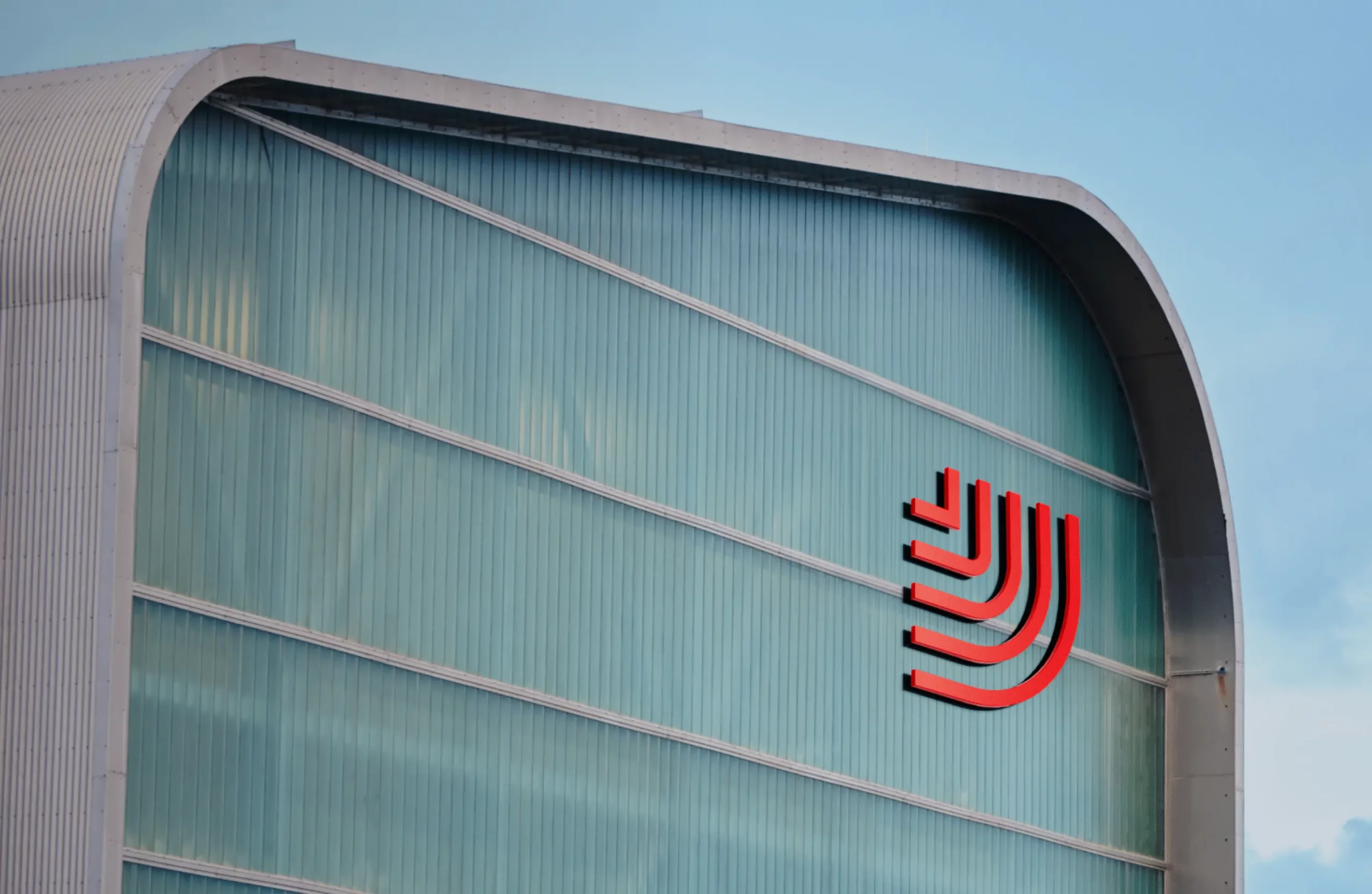
We started at the source. The logo, Cornerstone, was designed to reflect geothermal energy at its origin. Built from scratch, the wordmark and symbol draw inspiration from the geothermal pipes used on-site, the faultline that runs through Iceland, and the ripple effect of the energy HS Orka provides – offering a visual expression of energy at its origin and impact.

A flat-lay photograph of branded stationery and print materials from HS Orka’s visual identity. At the top right is a dark folder with the red and white HS Orka logo. Below and to the left are business cards in black and white with the logo and a person’s name. In the center are white sheets of paper and envelopes with minimal printed lines and the HS Orka wordmark. At bottom right is a promotional brochure or booklet cover showing a rugged rocky landscape, a curved red graphic accent, and the phrase “We understand our landscape” alongside the HS Orka logo. All elements are arranged neatly on a light surface, showcasing the brand’s clean typography and use of red, black, and white in its identity design
A grid of HS Orka brand identity elements showing the refreshed visual system. The layout includes the HS Orka wordmark, a circular line-based icon suggesting energy flow, bold red graphic shapes, and examples of typography and messaging set on light and dark backgrounds. The composition highlights the brand’s use of strong red accents, clean modern type, and structured graphic motifs that reference renewable energy, landscape, and engineering precision.
A photograph of the exterior of a modern industrial building in an open landscape, showing part of HS Orka’s facility with clean architectural lines and branded signage. The structure has a large flat façade with the red HS Orka logo or graphic mark prominently displayed against a light-colored wall, and the sky above is clear or lightly clouded. The composition highlights the building’s scale and the brand’s presence on the site, reflecting the company’s role in renewable energy production in Iceland.

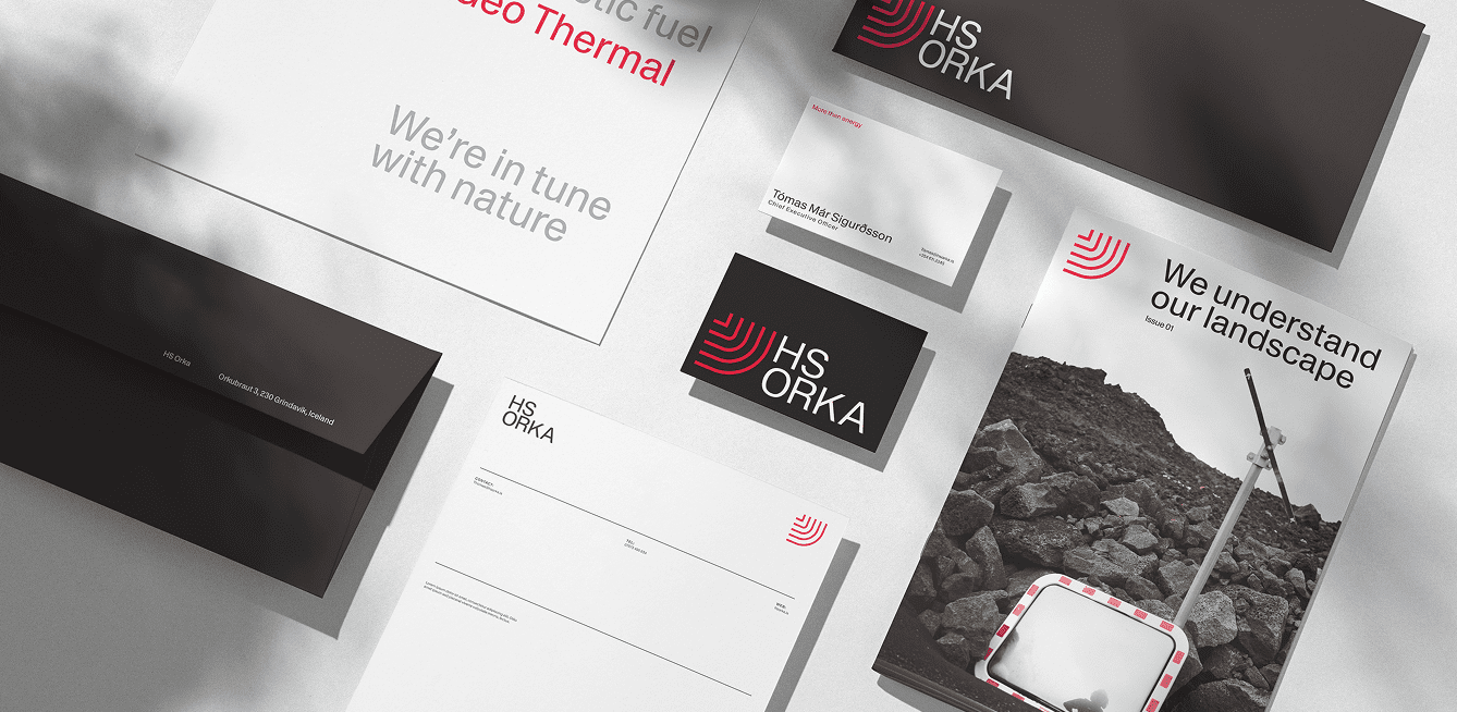
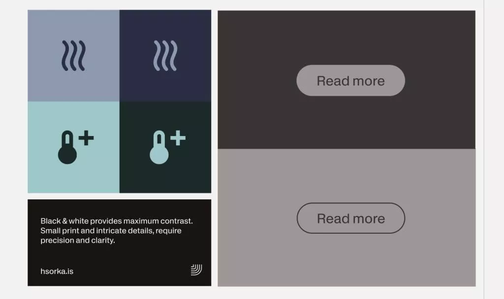
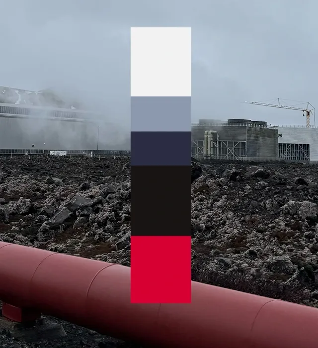
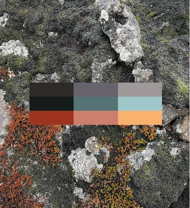
The color palette was 
drawn from the land itself

Inspired by photography taken onsite in Iceland, the primary palette reflects the red geothermal pipes, volcanic earth, and open skies surrounding HS Orka’s operations. Red is used sparingly and deliberately – an accent that signals presence without overpowering. A complementary secondary palette of soft greys, greens, and tones from native flora add warmth, clarity, and accessibility across all applications. 

A vertical stack of five brand colors on a blurred industrial landscape background showing geothermal infrastructure. From top to bottom the colors are a very light off-white, a muted cool blue-grey, a deep navy blue, a dark charcoal black, and a vibrant red accent at the bottom. The palette reflects HS Orka’s visual identity, with the red echoing geothermal pipes and the darker and neutral tones suggesting earth, sky, and engineered structures.
A vertical set of five rectangular color swatches representing the HS Orka brand palette. From top to bottom the colors are bright red, vivid orange-red, warm ochre yellow, cool pale blue, and deep charcoal black. The blocks are arranged against a white background, showing the brand’s bold, energetic, and balanced color system used across HS Orka visual identity materials. (Image from HS Orka brand project on Brandpie.)
A horizontal display of the HS Orka brand colour palette showing a series of bold and earthy swatches arranged side by side. The palette includes deep red (inspired by geothermal pipes), rich earth tones, muted natural shades drawn from Iceland’s landscape, and complementary neutrals that reflect volcanic ground, sky and engineered infrastructure. This visual overview highlights the brand’s use of warm accent red alongside grounded, natural hues to evoke both energy and place in the company’s identity.
A lineup of five smartphone screens showing HS Orka social media post designs as part of the brand’s visual identity. Each phone displays a different feed-style card with a mix of photography, branded graphics, headlines and captions: one shows a dramatic coastal power station landscape with the text “From nature to neighbourhoods,” another shows an industrial scene captioned “A hub for innovation,” a third shows community activity with “We’re part of the community,” a fourth features a portrait with “A day in the life of HS Orka,” and the last shows rugged coastal scenery with a call to “Submit an application” alongside the HS Orka red branded mark. The posts combine photography of Icelandic landscapes and people with bold typography and the red and black brand palette.

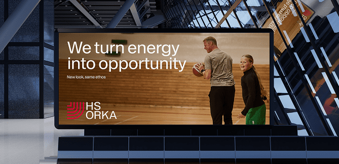
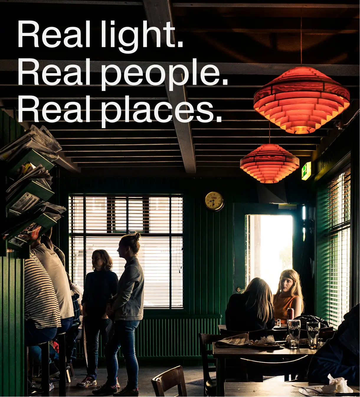
Showing the people behind the power

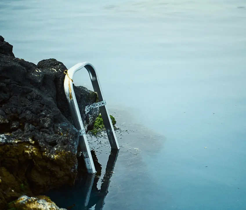
Photography and film and were key to reshaping perception. In a sector often defined by infrastructure and empty landscapes, we focused instead on the people – the communities HS Orka serves.
 
The new photography exemplifies this, showing everyday Icelanders living and working in the environments HS Orka supports. It’s editorial, cinematic, carefully composed, and distinctly Icelandic – dramatic and beautiful, yet human and unposed.
 
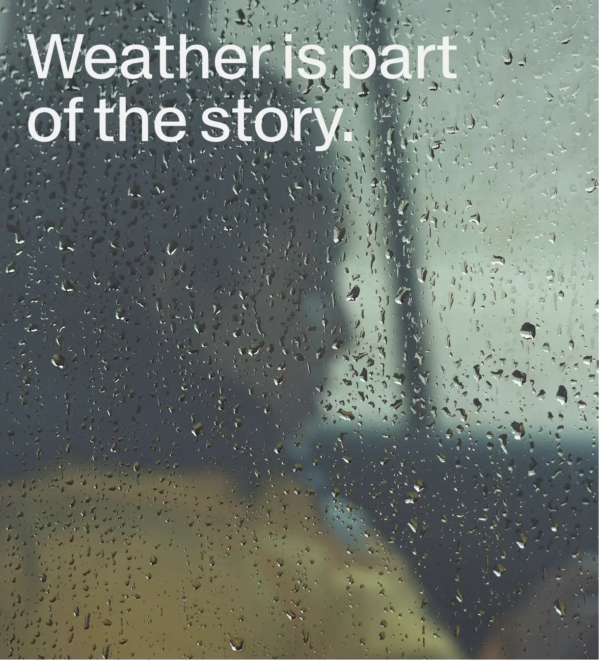
Crucially, we embraced the unpredictable Icelandic weather to capture the drama, mood, and reality of the environment. Because that’s the real Iceland, not the postcard.
 
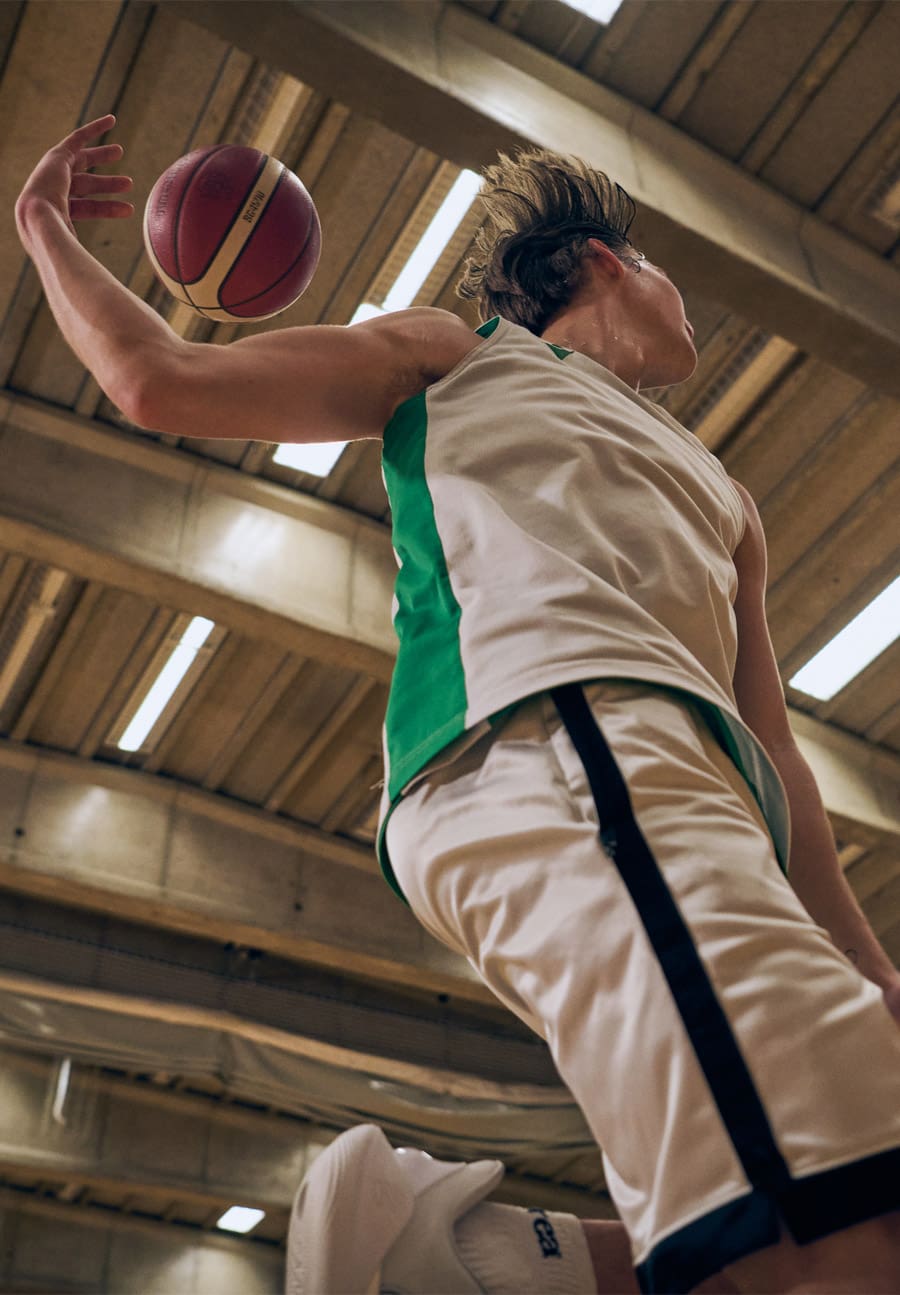
The films mirror this approach. We produced a set of three employee films, each offering a day-in-the-life perspective of people working across HS Orka. From tending horses to playing basketball with family, the films show what it means to be part of HS Orka and why it matters.
 
The brand film brings the idea of Respectful Innovation to life, translating it into something tangible and emotionally resonant for both internal and external audiences. It helps explain not just what HS Orka stands for, but how that belief shows up in practice.
 
Shooting and filming took place over several days across Iceland, using local crews to ensure cultural authenticity, capturing the true texture of Icelandic life.

A candid editorial-style photograph showing a group of Icelandic workers and community members engaged around HS Orka’s geothermal site. The scene includes people in workwear interacting with natural and industrial elements—such as rugged lava rock landscapes, steam vents, power plant structures, and geothermal equipment—capturing dramatic Icelandic light and weather conditions to reflect the human side of the energy company’s operations. This photography style is part of HS Orka’s brand work emphasizing real people and place within its renewable energy story.
A documentary-style photograph of two workers at an HS Orka geothermal facility in Iceland. One person in workwear and a hard hat is adjusting or inspecting industrial equipment with visible pipes and control elements, while another stands nearby observing. The background shows rugged volcanic terrain and infrastructure elements under natural light, conveying the scale and environment of geothermal energy operations. The image highlights people at work in an outdoor industrial-landscape setting, reflecting HS Orka’s focus on energy, engineering, and place. (From HS Orka brand photography on Brandpie.)
A candid brand photo showing an HS Orka employee. Behind a drip covered window (Image from HS Orka brand project on Brandpie.)
A collage of behind-the-scenes moments from the HS Orka brand project showing a mix of travel, work and team interactions. On the top row, people sit at a meeting table with laptops and notes, a vehicle’s trunk is open revealing packed gear, a person holds equipment and smiles at the camera, and a group of team members stand together smiling on a street. The bottom row shows outdoor shots in a rugged Icelandic landscape with crew filming with a camera, team members bundled in warm jackets at a volcanic site, and two people waving at the camera. The set of images conveys both the collaborative office work and on-location fieldwork involved in capturing brand photography and film for the project.

One of the biggest shifts for us has been moving to a brand that truly reflects who we are. With Brandpie’s support, we’ve been able to take control of our narrative. Now, we can tell our story clearly, confidently, and in a way that connects with the communities we serve.

Birna Lárusdóttir Communications Officer, HS Orka

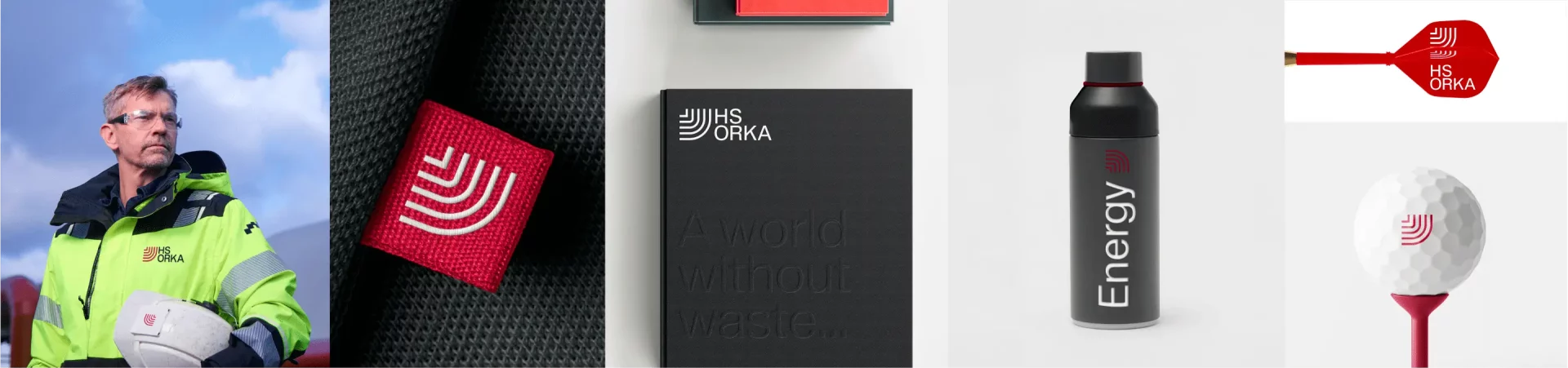
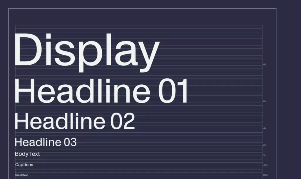
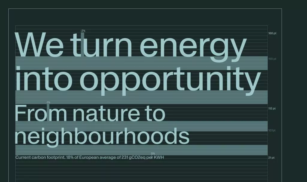
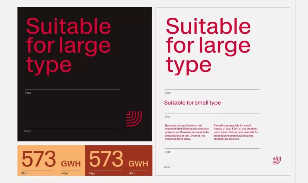
Typography and system thinking made it usable.

A single-weight, timeless typeface ensured clarity and simplicity, creating a toolkit that the whole organization could use with confidence and consistency.  

Every element, from logo and type to photography and film, was designed with care. Nothing superfluous or rushed. Just a brand identity as thoughtful and respectful as the innovation it represents.

A digital layout showing various typographic “containers” used in the HS Orka brand system. The graphic features bold red headline text blocks, white and black text on contrasting backgrounds, and simple geometric frames that hold short phrases or headlines. The designs demonstrate how typography and container shapes are used together to create structured messaging, with clean sans-serif type and strong red accents against white and dark backgrounds to reflect the brand’s visual identity. (From HS Orka brand work on Brandpie.)
A horizontal strip of mobile app interface screens showing HS Orka brand applications. The sequence includes clean, minimal UI layouts with photography of geothermal landscapes and infrastructure, overlaid with short headlines and labels set in the brand’s modern sans-serif type. Red accent elements and simple graphic containers highlight key information, demonstrating how the HS Orka visual identity is applied consistently across digital app experiences.