Your design system is your brand
A design system is not a toolkit. It’s your brand, built for digital.
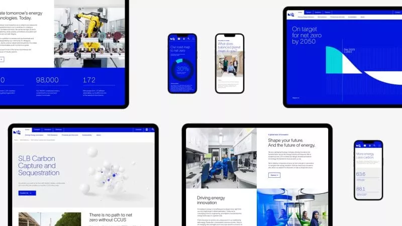
We translate brand strategy into clear design principles, reusable components, and UX and UI standards rooted in brand expression. The result: digital experiences that feel aligned, distinctive, and built to grow.
We work across product, brand, and technology teams to create systems that drive alignment across digital ecosystems, not uniformity. Shared foundations let different teams and needs coexist without fragmentation.
Focusing on what matters:
- Translating brand strategy into digital design principles.
- Website‑focused component and pattern definition.
- UX, UI and interaction standards rooted in brand expression.
- Guidance for flexible use across products and platforms.
- Accessibility and usability considerations baked in.
- Clear documentation to support confident adoption.
The outcome is simple: a digital design system that protects brand consistency, supports collaboration, and helps experiences evolve without losing their edge.
Credibility drives growth
Consistency is one of the strongest signals of brand credibility, especially in digital.
A robust digital design system brings control and coherence. It protects what makes your brand distinctive.
We’ve done this before
We work with global brands, complex organizations and teams navigating change, particularly where stakes are high and decisions need to be right from day one.

Let’s connect
Create a world-class digital experience that delivers results. Connect with Paul Campbell, Managing Partner, Digital.
Still have questions?
Brand guidelines define what a brand stands for and how it should show up. Design systems turn those principles into practical tools, components, patterns and rules that teams can use every day.
No. While the value compounds at scale, even smaller teams benefit from clarity, consistency and faster decision-making.
Our work is often anchored in the website experience, but it doesn’t stop there. We regularly support product teams by defining shared design foundations that allow for consistency, while still giving products the flexibility they need.
No. Our systems are designed to guide, not constrain. They provide clarity where it matters and flexibility where it’s needed, so teams can design confidently without diluting the brand.
We primarily use Figma to develop and maintain design systems, as it allows teams to work collaboratively with shared components, patterns and documentation, while supporting flexibility as experiences evolve.
By making it genuinely useful. We focus on clarity, relevance and ease of use, so teams see the system as an enabler, not an obstacle.
Websites are designed and built using the system in a modular way, giving teams a consistent set of components to work with. Importantly, those modules are designed with flexibility built in. They create coherence without forcing uniformity, allowing pages and experiences to adapt without feeling constrained.