Challenge
Prolink, a legacy technology brand based in Singapore, faced an inflection point. Once a household name in connectivity hardware, its presence had faded after 40 years in the market. Yet behind the scenes, Prolink had quietly expanded across 18 markets in Asia, the Middle East and beyond. With ambitions to grow in South Asia, Southeast Asia, Europe and the Americas, it needed a fundamental rethink.
The challenge was to reposition a low-profile hardware brand into an intuitive, emotionally resonant global brand, with relevance to modern consumers and retailers in highly competitive and saturated markets.
Idea
We reframed Prolink’s proposition around one core insight: life doesn’t come with a set of instructions. In a world of hypercomplex digital devices, Prolink’s products stood out for their simplicity, ease, and reliability. This inspired a new brand philosophy: Connect your life.
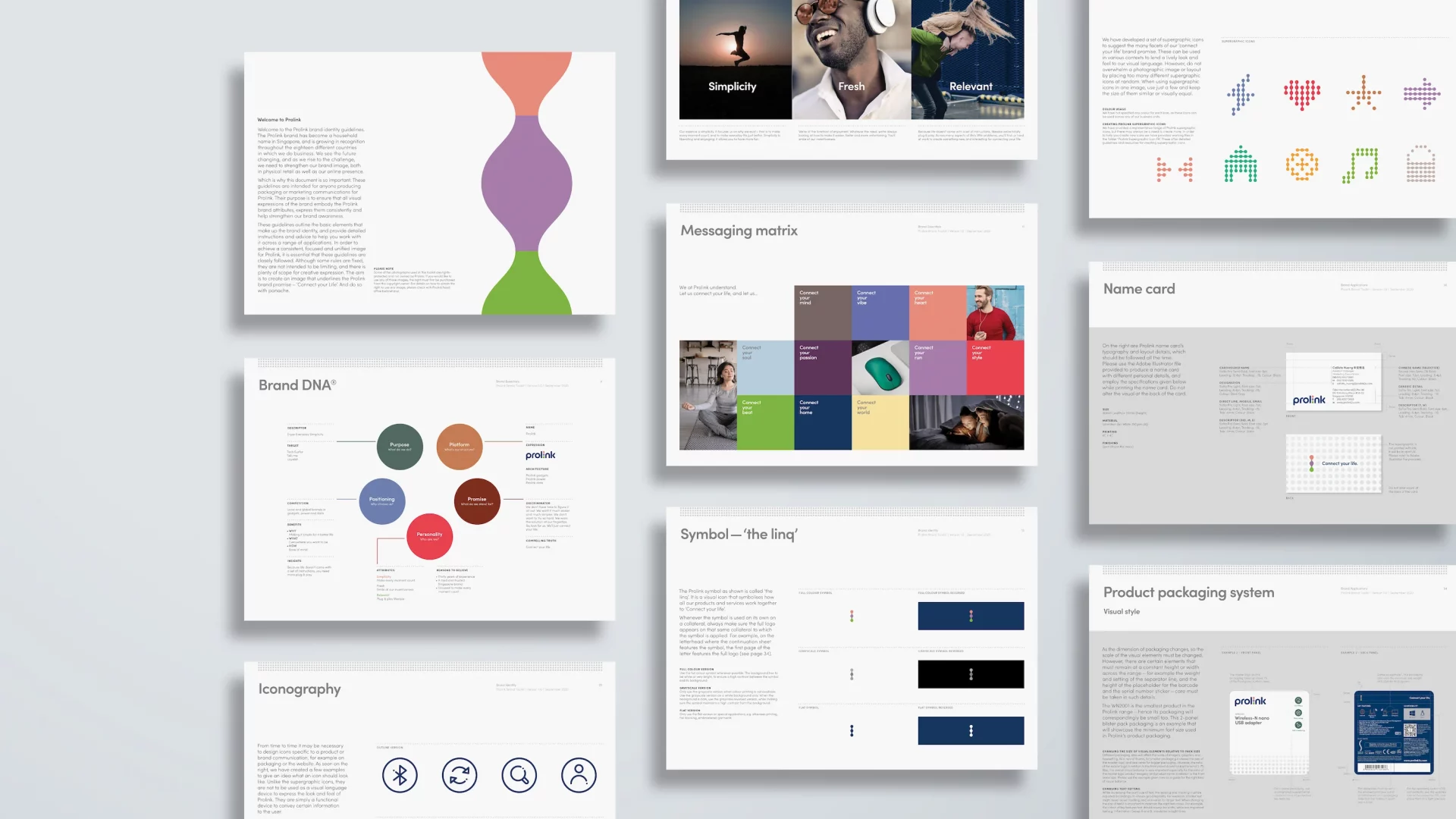
We evolved the identity while respecting brand equity, modernizing the visual system and creating a distinctive new brand asset – the LINQ – that anchored the design system and was integrated into packaging and product experiences.
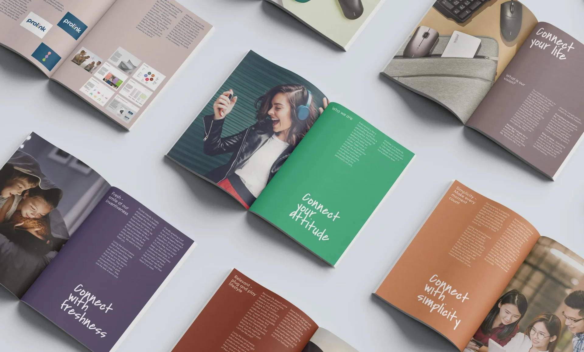
The idea created instant versatility for campaigns: Connect your run. Connect your data. Connect your day.
This created a universal brand platform that stretched from product lines to packaging to internal culture.
Reactivating Prolink
The transformation went far beyond visuals or messaging. It was a reactivation of the Prolink brand across every dimension.
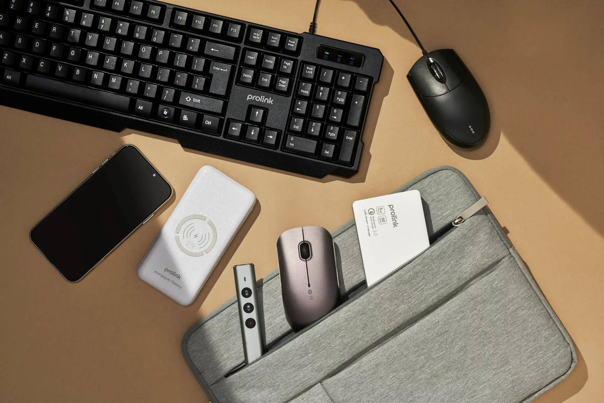
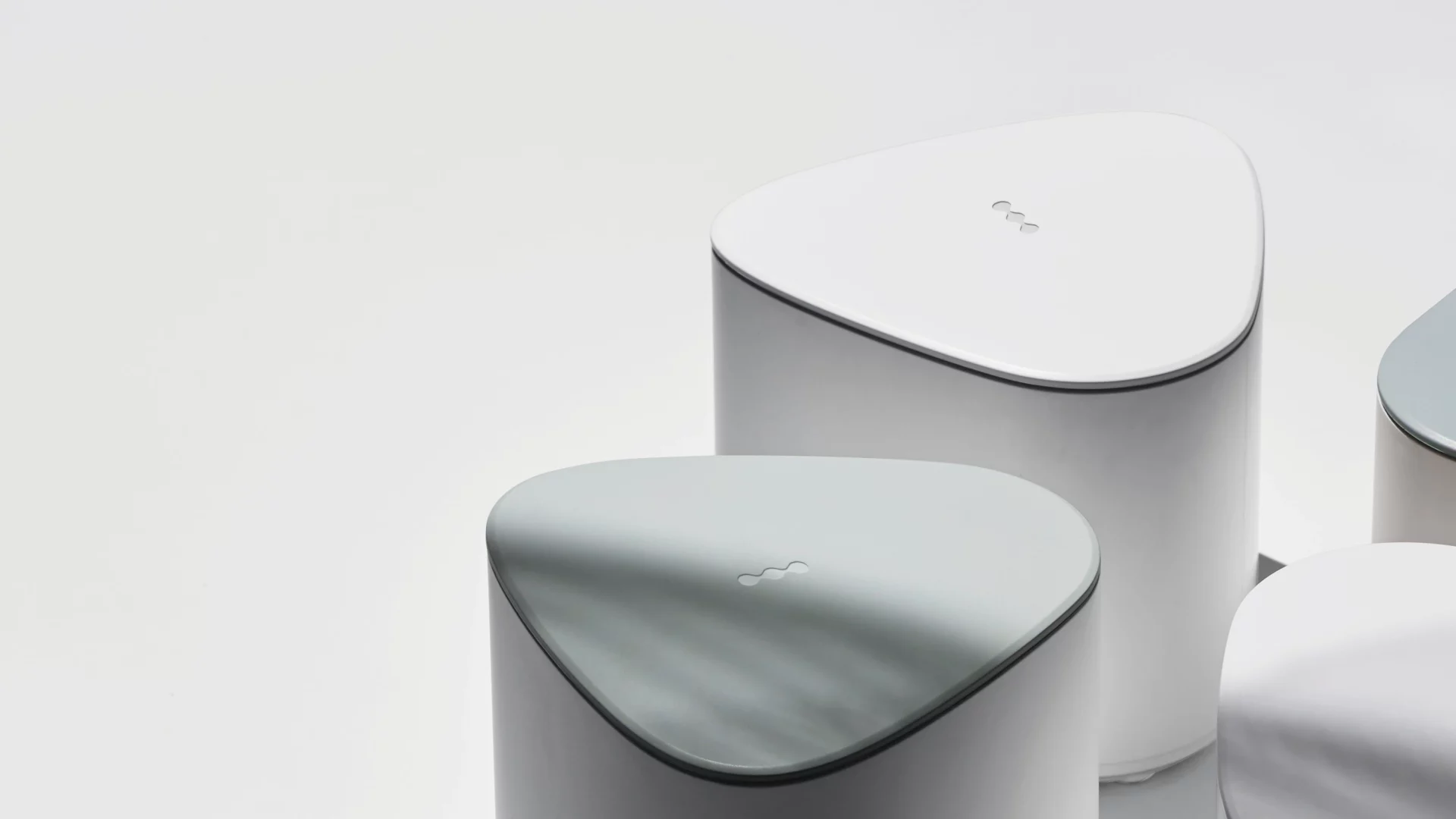
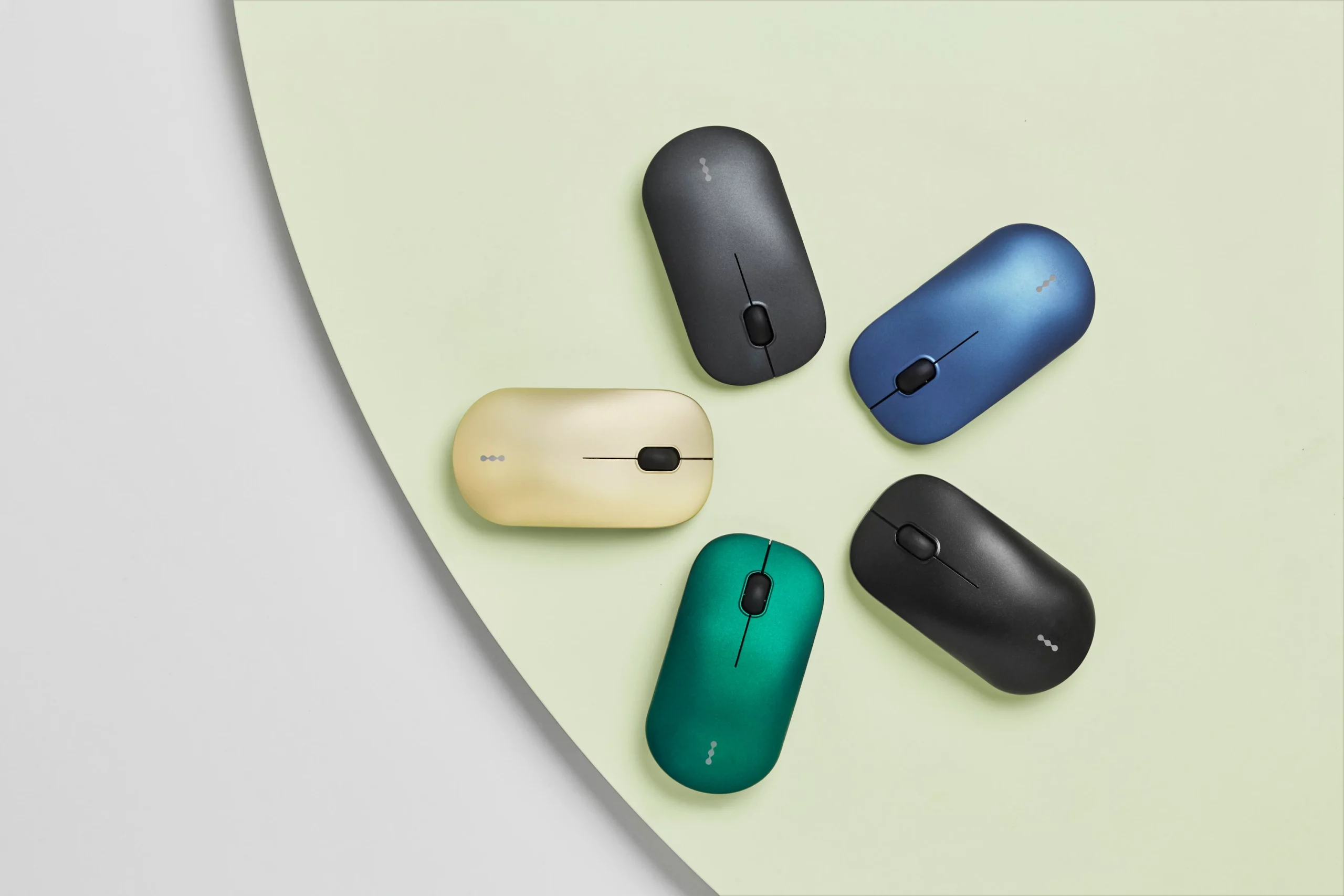
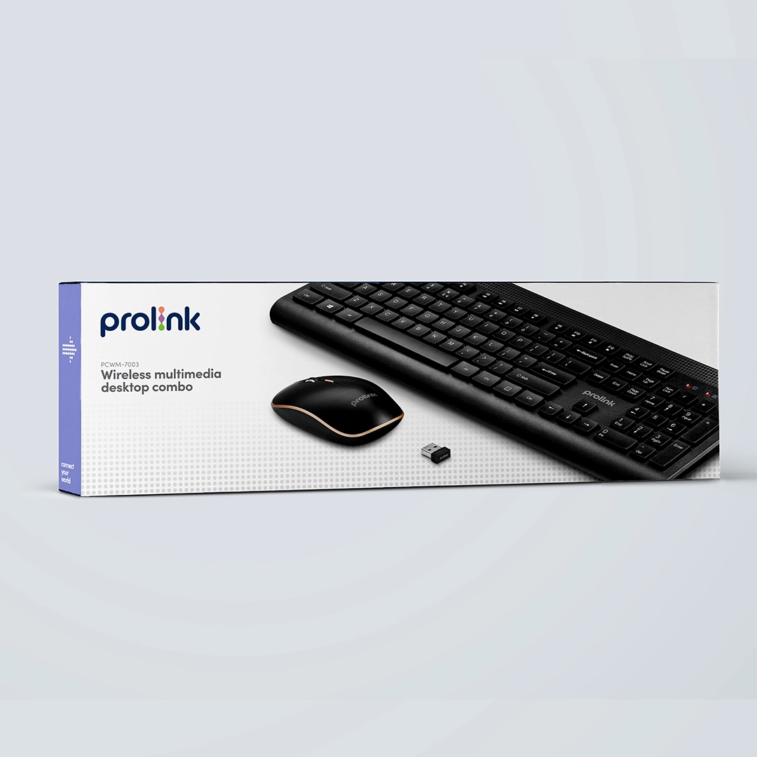
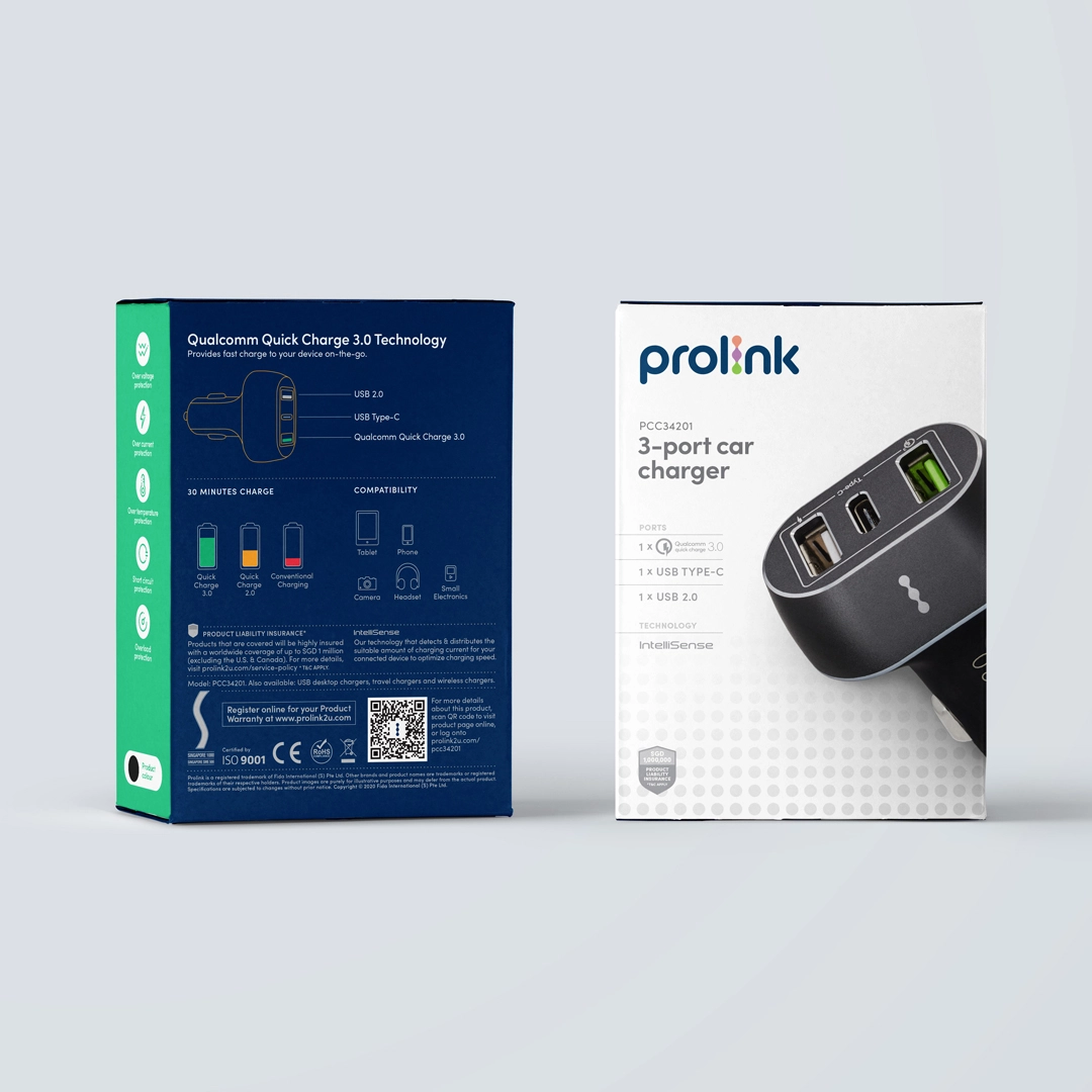
Visually, weretained the core blue but deepened the tone for modernity. A new logotype replaced the outdated 1980s wordmark. Most importantly, we created the LINQ icon – a bold, stylized graphic derived from the “I” in the logotype – representing connectivity and simplicity. It became an operational asset, blind-embossed on packaging, hardware and even integrated into industrial design across thousands of products.
Connected messaging
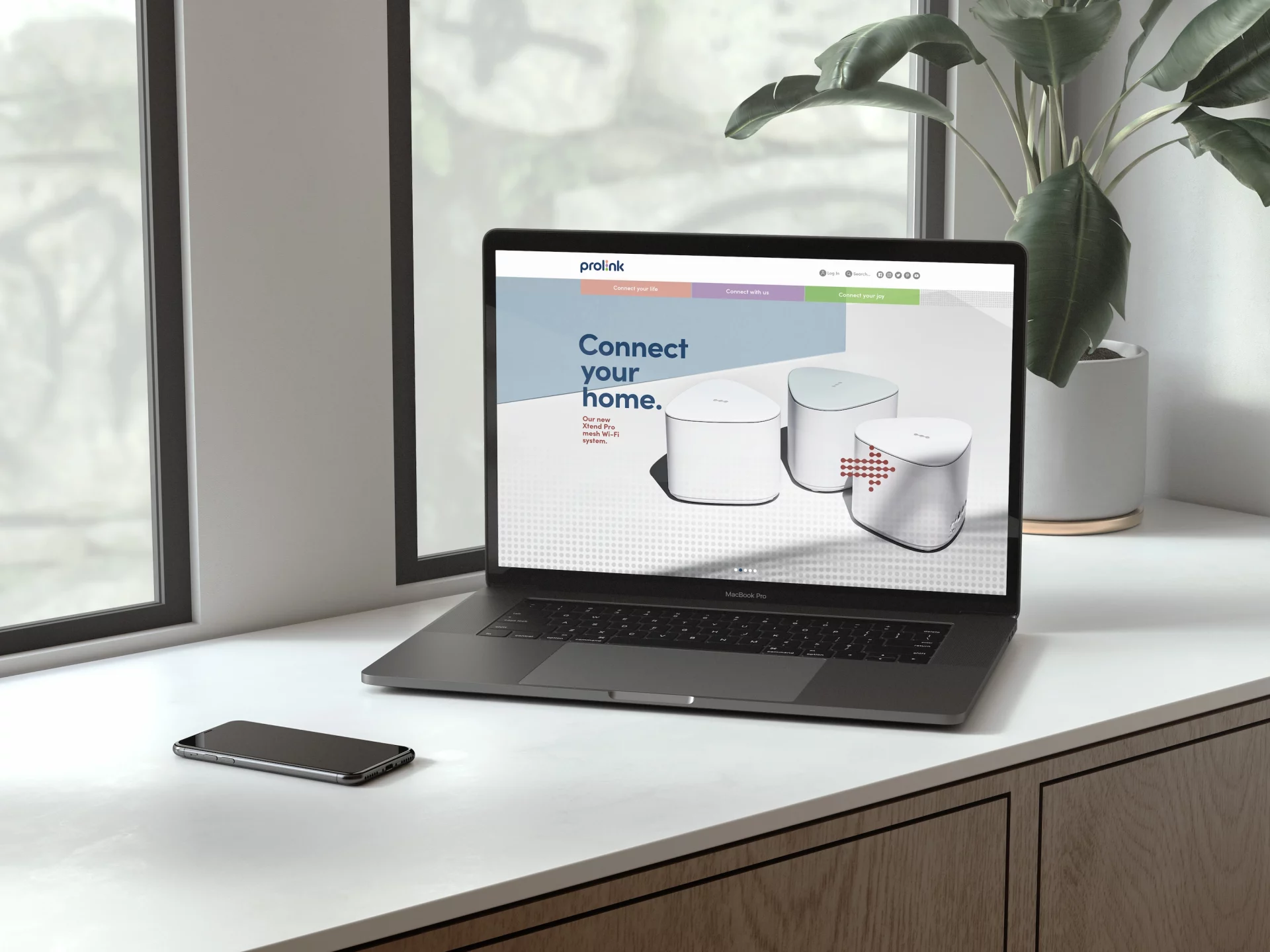
In messaging, the “Connect your…” framework unlocked a modular, consistent brand voice across every channel – packaging, digital, retail, and product manuals. From “Connect your home” to “Connect your adventure,” every application gave emotional colour to functional products.
Internally,employees across all 18 markets were engaged with a brand activation campaign titled “Connect your attitude”. Staff were invited to take Polaroids in branded t-shirts and create their own personal taglines. These stories – “Connect your purpose”, “Connect your team”, “Connect your vibe” – turned the philosophy into lived behaviour, linking employee pride to customer experience.
Making Prolink memorable again
Finally, a comprehensive brand system – from templates and product configuration guides to dot iconography and digital assets – empowered internal teams to implement consistently, without creative bottlenecks.
The result? A once-forgotten brand became sticky again, inside and out. With 67% of customers returning due to positive staff experiences, the internal brand became as critical as the external one.