Challenge
E Source sits at the heart of North America’s utility ecosystem. For nearly four decades, it has helped utilities navigate change, make smarter decisions, and deliver operational excellence.
Its model is distinctive. A true utility specialist. Entirely focused on solving the sector’s most complex challenges—from decarbonization and grid resilience to customer experience and capital productivity. Across research, data science, and consulting, E Source connects insight with action.
But rapid growth had introduced complexity.
A series of acquisitions expanded capability but blurred the story. Internally, teams operated in silos, each with its own culture and go-to-market rhythm. Externally, clients saw deep expertise—but not a fully integrated offer. Cross-selling was inconsistent. Sales teams weren’t aligned. The brand no longer reflected the scale of ambition.
The new CEO’s mandate was clear: unite the business, build momentum, and reposition E Source as the transformation partner utilities need—fast.
Process
Brandpie partnered with E Source to define a single, unifying story—one capable of aligning leadership, cutting through complexity, and accelerating impact in the market. We moved at pace. A focused, sprint-based program designed to create clarity quickly and turn it into action. Insight-led, decision-driven, and relentlessly practical.
At the center of the process was a live workshop in Dallas, bringing the full leadership team together. Tensions were surfaced. Trade-offs were made. Ambiguity was removed. The result was alignment around a single direction and a shared ambition for growth.
Idea
‘Total clarity. Accelerated impact.’
Utilities operate in an environment defined by complexity and constant pressure to act. But fragmented insight and siloed thinking slow decision-making and erode confidence.
What leaders told us was simple. They don’t need more information. They need clarity—and they need it fast. That insight became the organizing idea for the brand.
Total clarity. Accelerated impact. captures what makes E Source different and what its clients value most. It positions the firm as the only partner purpose-built to connect insight with action—helping utilities move forward with speed, precision, and confidence.
The idea now anchors the entire organization: brand, culture, and go-to-market.
From this core idea, we defined a clear, unified value proposition. One that repositioned E Source as an integrated solutions partner—not a collection of specialist services. It created the clarity needed to scale cross-selling, sharpen sales conversations, and compete beyond traditional peer groups.

Culture, sharpened for pace
Clarity on the outside demanded clarity within.
E Source’s existing values no longer reflected how the business needed to operate. They were well-intentioned, but vague, inconsistent, and rarely used.
Working closely with the CEO and leadership team, we co-created a new, behavior-led set of values. Each expressed as a verb. Each designed to guide decisions, reinforce accountability, and build momentum.
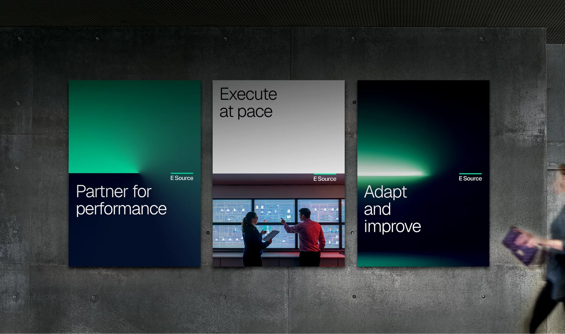
Partner for performance
Collaboration over competition. Shared goals. Better outcomes—for clients and for each other.
Execute at pace
Speed matters. Expertise applied decisively. Momentum built through action.
Adapt and improve
Progress over perfection. Challenge assumptions. Keep moving forward.
Together, they underpin a performance culture that matches the brand promise: confident, focused, and outcome-driven. .
A refined visual identity
With clarity established as the brand’s north star, we then translated the strategy into a considered evolution of the visual identity.
This was not reinvention for its own sake. It was refinement—with intent.
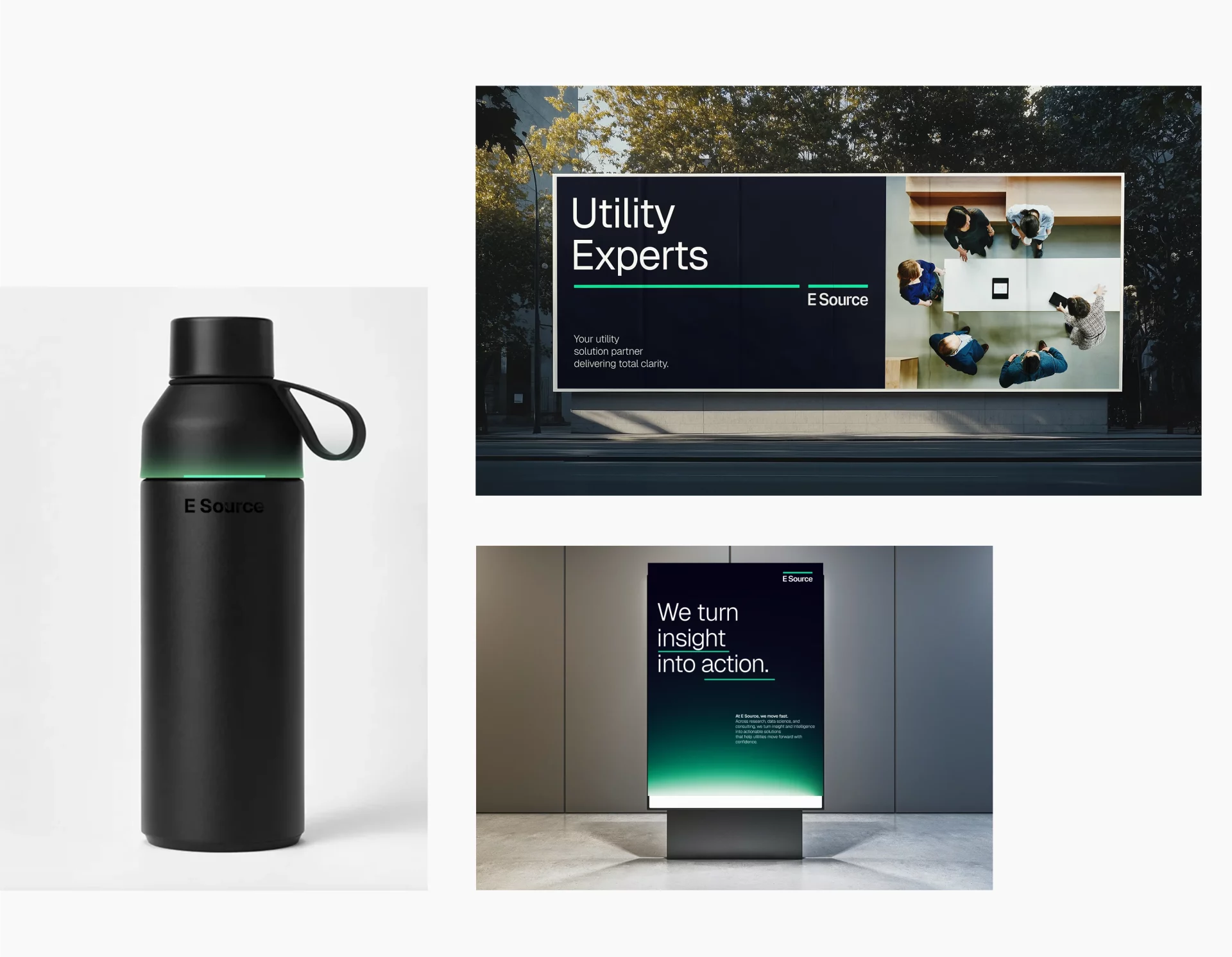
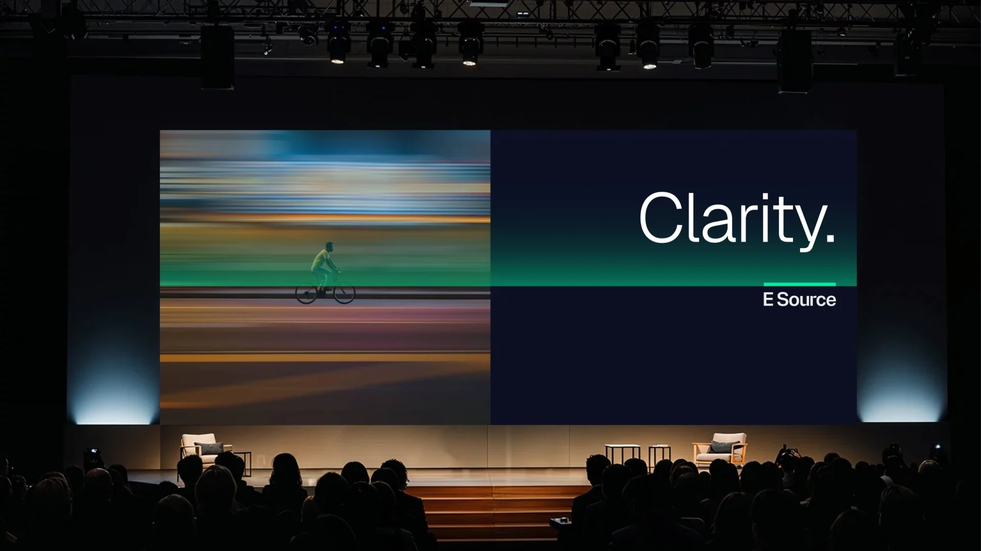
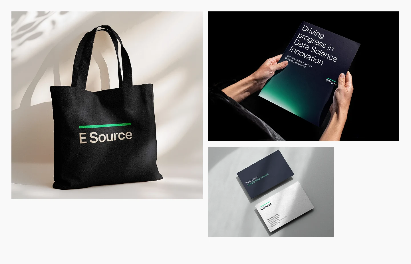
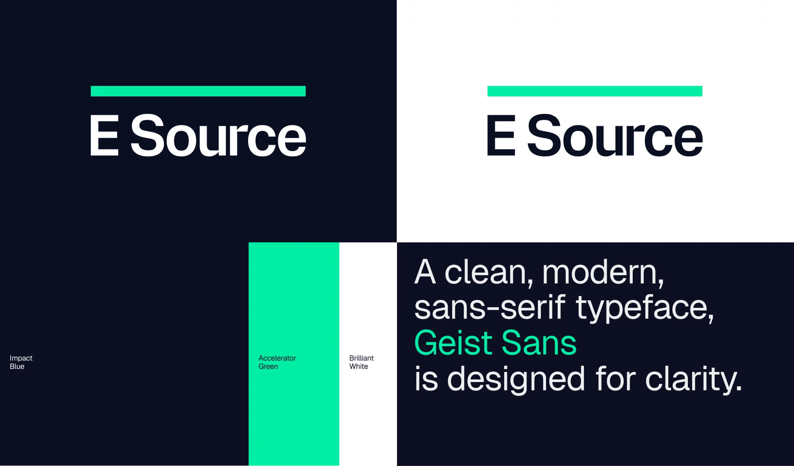
At the center sits the Line of Clarity: a simple but powerful visual device that reflects how E Source cuts through noise and connects insight to action. It brings structure to layouts, guides information flow, and reinforces focus across every touchpoint.
The system is precise and disciplined. A refreshed logo signals confidence. A refined color palette balances authority with momentum. Deep blues sharpened by a distinctive, energetic green. Typography, grids, and motion all reinforce clarity and pace.
Imagery is grounded and human. Real people. Real infrastructure. Real environments. An honest portrayal of a sector in transformation.
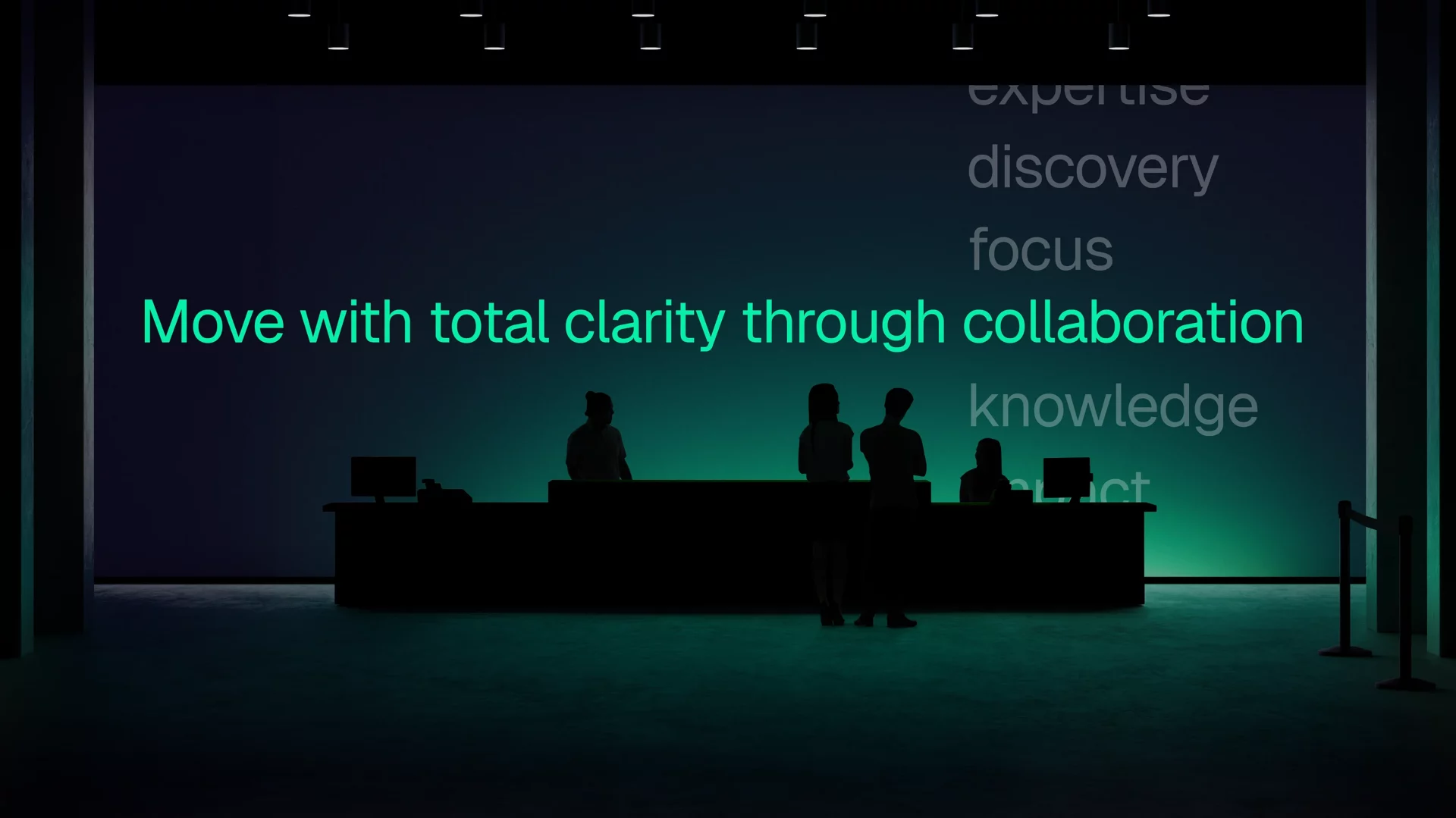
Designed as a single, flexible system, the identity works seamlessly across digital, data visualization, events, and internal communications. Giving E Source a consistent, confident presence wherever it shows up.



One story. Everywhere.
To make the brand real across the organization, we built a comprehensive messaging ecosystem—including a clear brand narrative, messaging pillars, and distinct business-unit value propositions, aligned to a single overarching story.
Through a series of Connect workshops, teams mapped real customer challenges and buying triggers—turning strategy into practical proof points for sales and delivery.
The result is a shared language that gives every team the flexibility and confidence to speak as one E Source. Internally and externally.
The outcome
A unified business.
A sharpened proposition.
A brand built for speed and scale.
E Source now shows up with clarity, confidence, and momentum—internally aligned and externally differentiated. Positioned not just to navigate complexity, but to lead the utility sector forward.