Challenge
Relevate Power was formed in May 2023 with one powerful mission: to produce clean affordable energy and, through this, power local communities and enhance quality of life.
Relevate Power acquires water dams in the US, restores them to create affordable clean power and connects them back to local customers, enabling businesses to meet their requirements to go green, creating local jobs, and delivering sustainable energy to communities. However, the current brand did not fully encapsulate the ambition and passion of the business.
CEO Matt Wenger reached out to Brandpie with a challenge to rebuild and literally elevate the brand to better capture the essence of the company – powering local communities with clean affordable energy – and deliver this, ready to launch, in two months.
Idea
Working fast and iteratively, we delivered a new positioning, name, brand identity, website, corporate assets, and messaging, mirroring the energy and passion that lies at the heart of the business – to make a difference.
The new name, Relevate Power, was created in just four weeks. To ‘relevate’ is to lift the spirit, to enhance, improve, restore character, and to elevate. This perfectly captures the company’s commitment to regeneration, renewal, and its pledge to help local communities flourish.
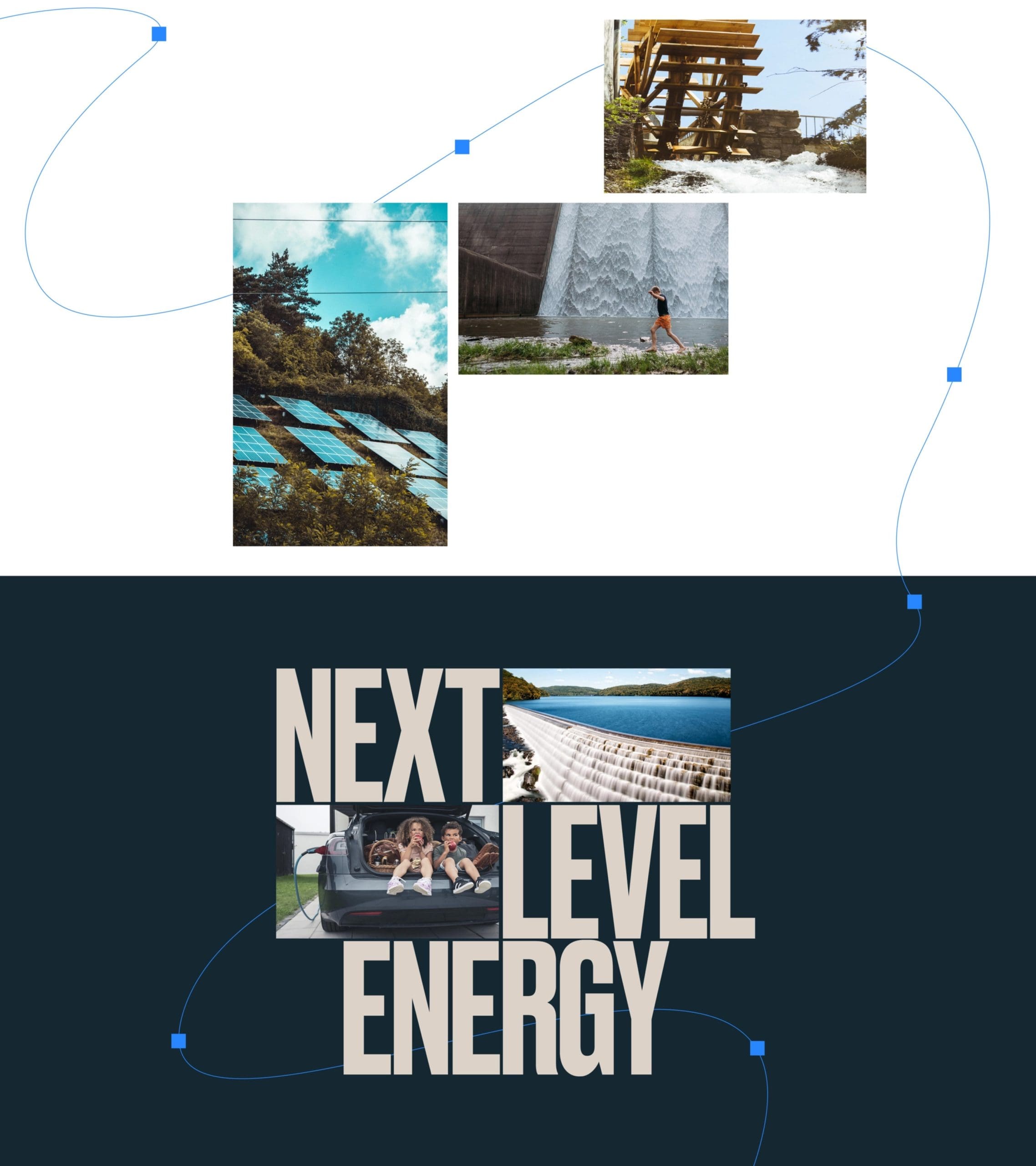
This is a company of ambitious people who needed a positioning to match their drive and vision to change the face of renewables. ‘Next level energy’ captures that ambition; taking renewables to a new level, not just by renewing outdated waterpower dams, but by enhancing renewable energy itself through new technology to create a clean, affordable 24/7 energy stack. It also captures how they enable people within the business to take their careers to the next level.
I’ve been through a few rebrands and this was by far the most impressive. The Brandpie team were phenomenal – well organized, full of ideas, and incredibly determined, they captured the perfect balance of creativity and execution.
Matthew Wenger CEO and Co-Founder

A next level identity
Every element of the brand was given careful consideration. The new identity symbol delivers on several levels: It represents the flow of water through a turbine, the regeneration of waterpower infrastructure, and the combination of sustainable renewable energy sources – water and solar.
The graphic blue line used throughout the visual system represents river systems and the source of life, connecting nature and humanity. The use of nodes represents how waterpower dams act as the focal point for community development and growth. This subtle graphic element is balanced with a bold typeface and strong, neutral color palette, which represent the foundational strength of the dam powering local communities.

A website to drive change
To meet the project’s timing challenges, we designed and developed the .com experience alongside the brand and visual identity workstream. Being a very reactive and fluid process, we adopted an agile way of working; quickly crafting the structure, principal UI design system, and experience of the website. The site was then fully developed and authored through a custom solution in WebFlow. This enabled us to create a high quality, content-managed solution within the tight timeline.
We really pushed their process, executing a complete brand refresh in 8 weeks. And the outcome was elite. An inconceivable timeframe to not only land on a transformative brand, but launch it. Fun, engaging, focused, and talented.
Matthew Wenger CEO and Co-Founder
Related work
