Challenge
Founded in 2016 by two Hydrogen Group executives, Kubrick expanded so fast that the business had outgrown the brand. Whilst they had a strong and expanding client base that included AstraZeneca, Deliveroo, Shell, HSBC, the brand didn’t reflect the commercial success of the business.
With ambitions of further growth and expansion into new areas, Kubrick needed to project a market-leading brand to reflect the company they were becoming, instead of the company they had originally set up.
Idea
Brandpie worked closely with Kubrick’s leadership to clarify the business priorities and key audiences. The website needed to address a business audience and a young, post-graduate audience – requiring an aesthetic and experience to engage both, without alienating either.
After conversations with the Kubrick board, its clients, investors and a VYTALS focus group with employees, to build a 360 perspective, Brandpie crystallized Kubrick’s strengths, points of difference and opportunity areas to shape the new positioning, website, and identity.
+332%
Increase in monthly website activity (versus previous year)
+2min
Increase in average session duration (versus previous year)
+141%
Increase in LinkedIn impressions following launch
+88.6%
Increase in Twitter impressions following launch
Brandpie brought energy, exciting ideas and fresh thinking to challenge us. We now have a brand we’re really proud of – one that will further elevate our business and generate real ROI.
Tim Smeaton Managing Partner, Kubrick
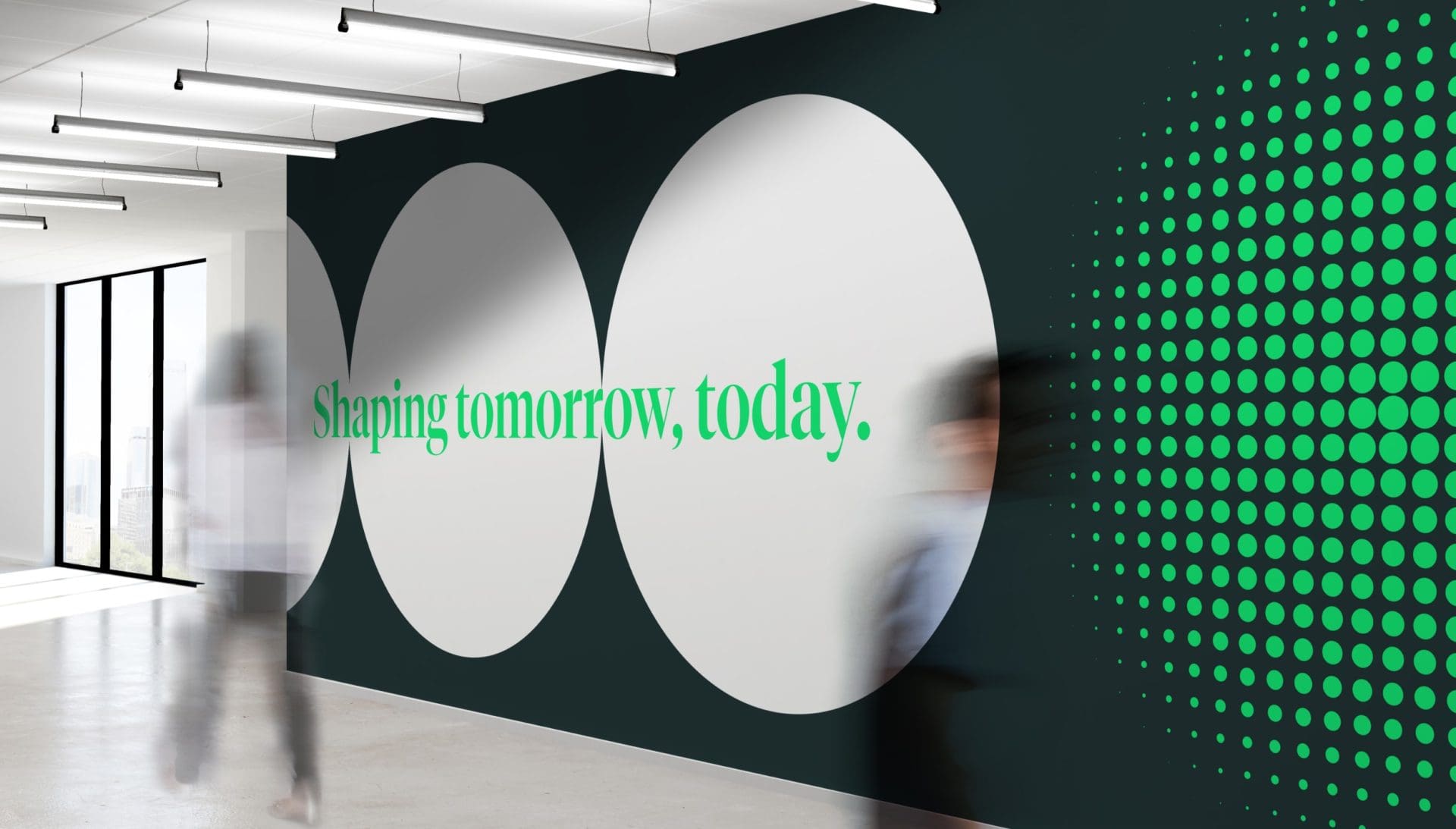
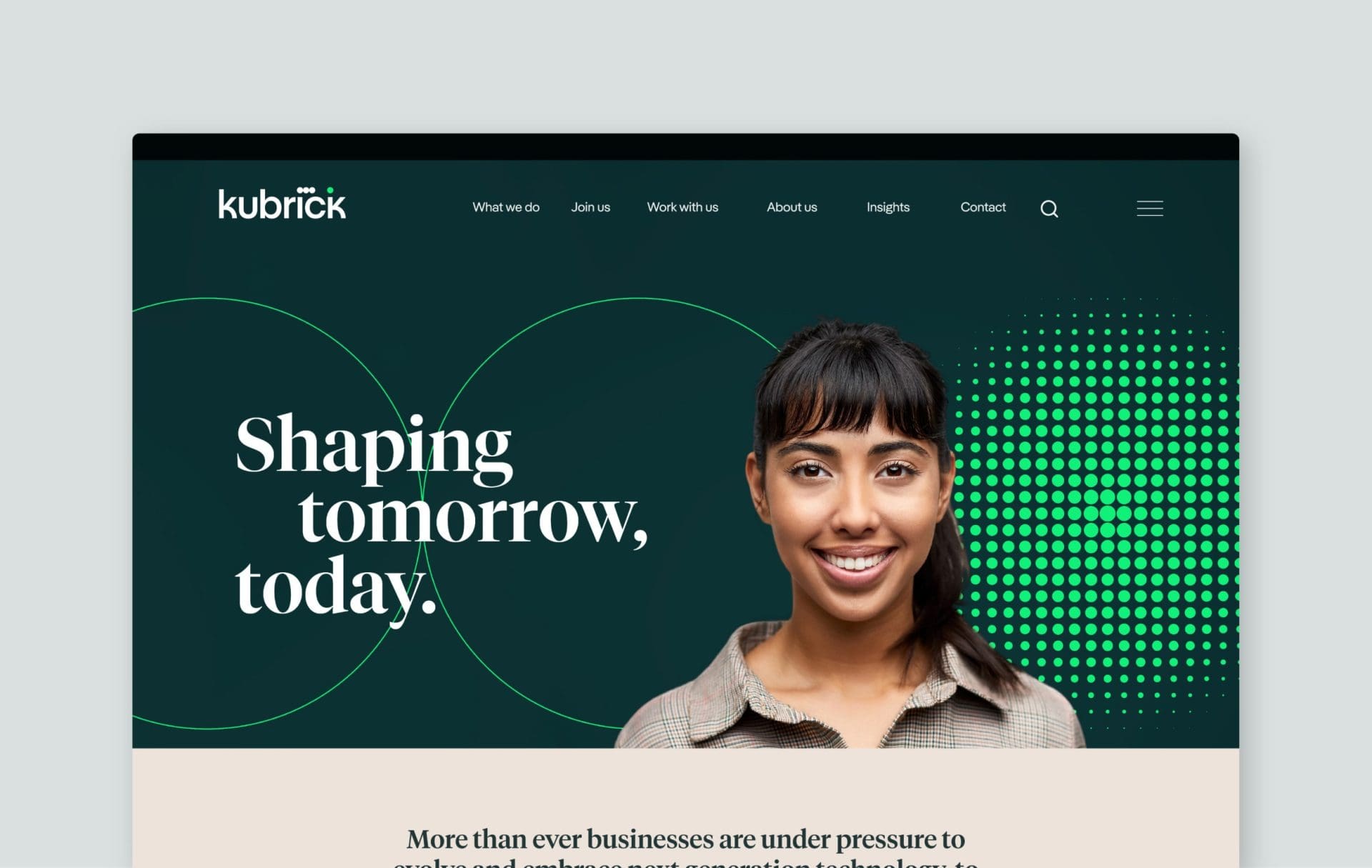
Brand positioning: Shaping tomorrow, today
The strategic analysis manifested into the positioning statement ‘Shaping tomorrow, today’ – a pithy and punchy articulation of the company’s vision of shaping the workforce and organizations of tomorrow with the skills and talent needed today.
Visual idea
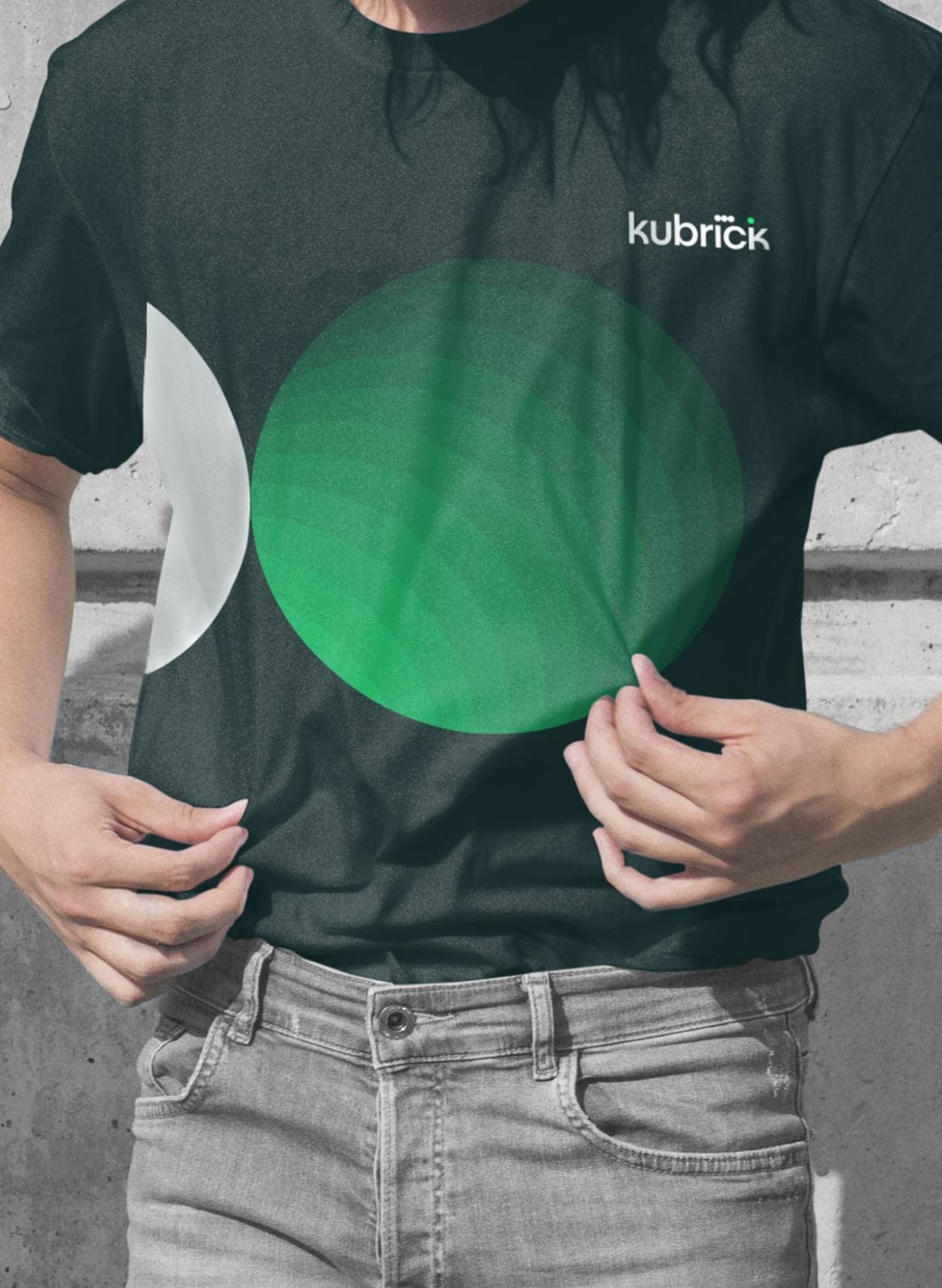
The positioning ‘shaping tomorrow, today’ sits at the heart of the brand identity and is brought to life by the idea of ‘getting ahead’, which is what you need to do to shape tomorrow. Transference of momentum is the visual metaphor for this – three joined ellipses and a fourth, sitting ahead. The bright green dot represents every Kubrick consultant, client, alumnus and partner who can accelerate and amplify their capabilities to get ahead.
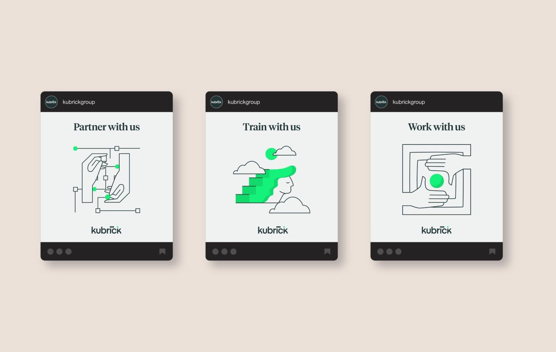
Energetic ellipses
The ‘energetic ellipses’ are derived from the green dot in the Kubrick logo. They are deployed dynamically throughout the visual identity as a nod towards machine learning, data, artificial intelligence to create impact, symbolic of the positive impact Kubrick people have in the world.
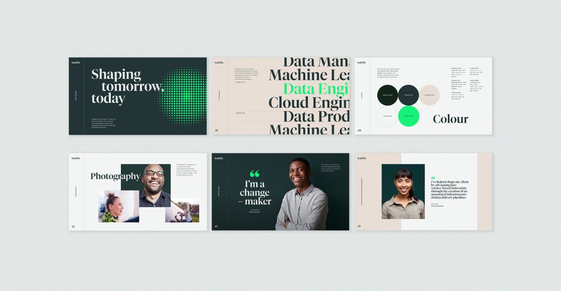
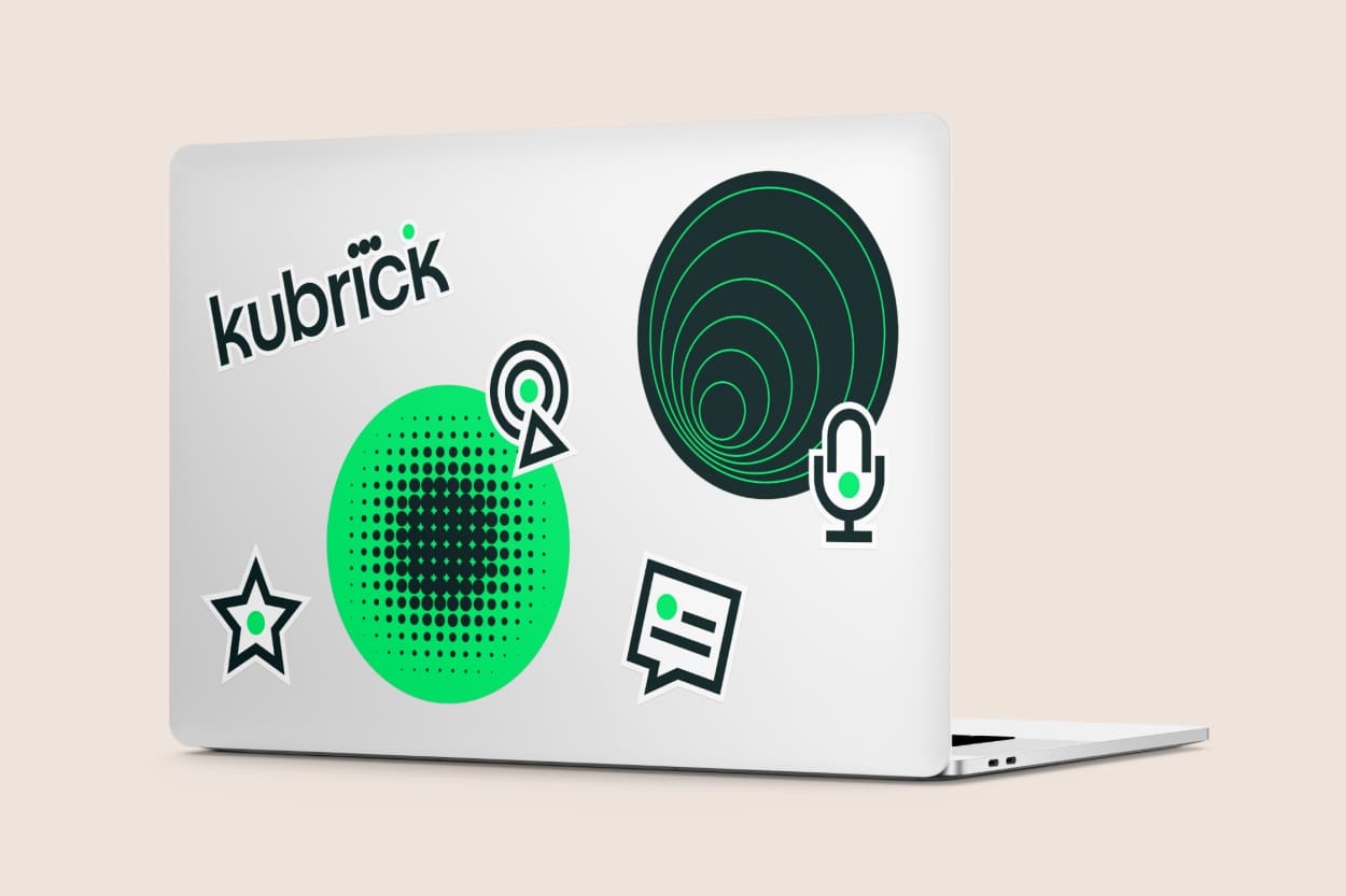
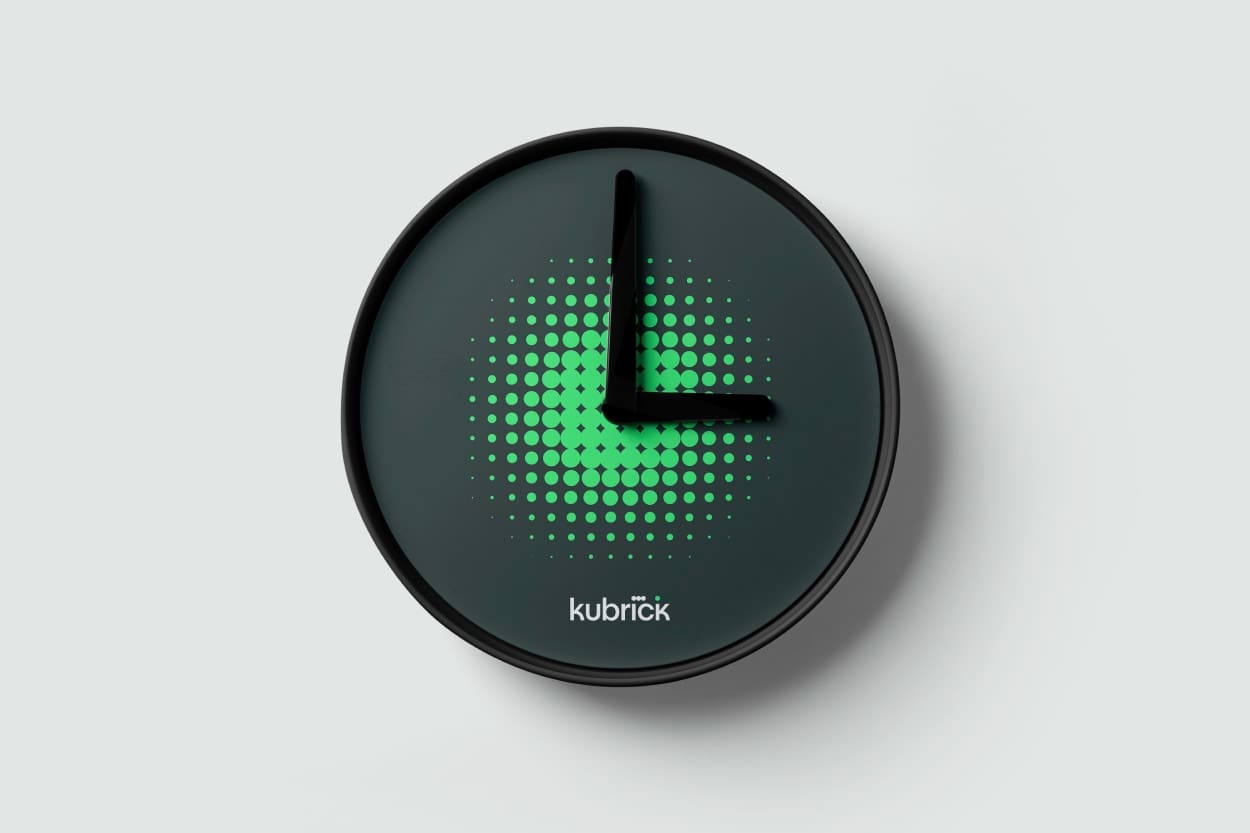
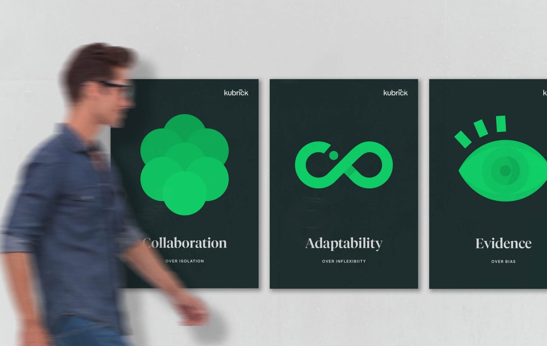
Brand toolkit
Kubrick’s new visual identity balances people and technology in perfect harmony through the use of carefully crafted design elements; typography, colour palette, photography style, portraiture style and a family of bespoke icons and illustrations that depict integral parts of Kubrick’s business.
Website
Adopting a process of rapid design and iteration, working closely with Kubrick throughout, Brandpie developed a user experience and content strategy. Reinforcing Kubrick’s new positioning, refined visual identity whilst working hard to increase business engagement and build a core marketing channel that elevated the business and gave them a platform for the future.
Brandpie provided the end-to-end solution, including full technical development and custom integration into Craft CMS. The end result was a confident and sophisticated website experience, fully manageable by Kubrick’s internal marketing team, integrated with their wider digital ecosystem, and delivered a step change in their presence online.
View the new Kubrick website here: kubrickgroup.com
Launch
The new brand was unveiled internally through a series of interactive sessions with leadership and employees. We engaged Kubrick in a conversation on what needed to change to reflect the new brand in the market and ensure an aligned experience for employees, clients and partners.
Employee feedback
“It gave me goose bumps” – Leadership team
“It makes me really proud to work here” – Consultant
“I have received some positive feedback on how the firm currently presents itself. One of which was from PwC.”
“From conversations with clients, the new brand puts us miles above where we were. It looks a lot more high quality, cemented and scaled.”
“I think the website and rebrand has been great. I definitely feel the direction and positioning of the company is a lot clearer as a result too.”
Let’s talk
What would you like to discuss? We’re here to listen.
Related work