Challenge
Capgemini is one of the largest technology services groups in the world. But its brand did not reflect the impact of its work for businesses today or the passion and energy of its people. Our challenge was a sensitive yet essential one – reflect the brand’s character and nature, while staying true to its heritage and belief in the power of its people.
Idea
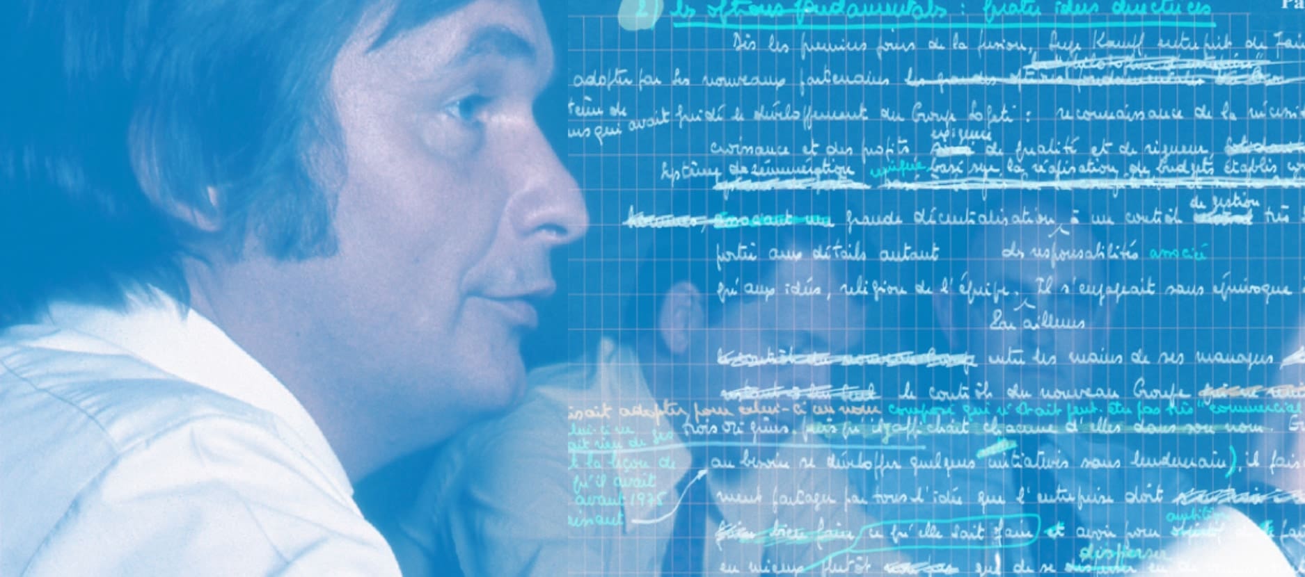
We gave technology a human touch. Creating a digital-first identity inspired by the handwriting of Capgemini’s founder, Serge Kampf. His signature becomes their signature and their symbol of trust.
At launch, the new identity captured the imagination of Capgemini’s 160,000 employees who embraced its uniqueness and its endorsement of their founder’s legacy.
Results
With Brandpie we have developed an identity that demonstrates the agility of Capgemini. In this age of digital interactions, handwriting our name emphasizes our humanity and that clients can trust us.
Virginie Regis Group Marketing & Communications Director
“His signature becomes our signature”
Over almost 50 years Serge Kampf built Capgemini into a global player in technology services. He believed good business was built on the strength of personal relationships and a human touch. Our wordmark is crafted from Serge Kampf’s own handwriting, so that uniquely, his signature has become the signature and promise of the business. It’s a powerful message of trust encapsulated in an identity, paying respect to the legacy of the founder and yet completely relevant in today’s uncertain business world.

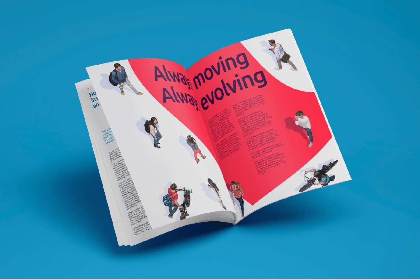
“Always moving. Always evolving.”
Coinciding with the Group’s 50th anniversary, this is the first overhaul of Capgemini’s brand identity since 2004. We worked in close collaboration with Capgemini to create a unique identity – one that is digitally friendly, disruptive and yet efficient to use.
The brand’s iconic spade emblem has been redrawn to reflect a more contemporary and constantly evolving world. It is flexible and fluid, exhibiting a sense of positive energy. The revitalized spade flows, folds and turns, revealing different sides of Capgemini, their precision and flexibility. An invigorating new colour palette, including vibrant blues have been introduced, to accompany the darker blue that represents the dependability of the brand and its people. In all this creates a unique brand in its sector, one borne from its heritage but ahead of its time.

“Everyone feels two inches taller”
Reaction to the new brand from Capgemini people at launch was phenomenal. the new identity was celebrated across the world during the launch and it has engendered a new sense of pride among the 160,000 people working for the business.
Related work


